Layout


With the introduction of Channel 8's fresh visual identity, the Hurricane Guide underwent a transformative update. Having been in circulation for numerous years, the booklet had evolved from print to digital while retaining elements reminiscent of its printed origins.
Anticipating how our end users would typically access the booklet, I pitched an interactive PDF format. This format empowers users to swiftly locate specific information and adapt to the county's newly established online communication channels for shelters and flood zones. These channels are seamlessly integrated within the booklet, offering convenient links to official county sources.
Given the digital-only nature of this booklet, I departed from conventional print paradigms. The absence of physical constraints enabled us to include all necessary information while maintaining an open and minimalistic design. This design approach aligns harmoniously with our brand identity, fostering a sense of calm essential for individuals preparing for hurricane season.
The updated format was met with enthusiasm within our team, and it also presented a unique opportunity for our sales team to offer clickable ads of higher value to our clients. The booklet's funding is predominantly derived from advertisements sold by our sales team, and we had the privilege of designing an ad for Hales (pictured) who generously supported this endeavor.


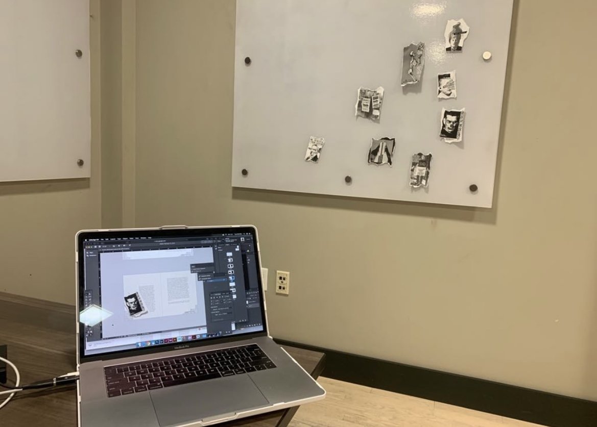
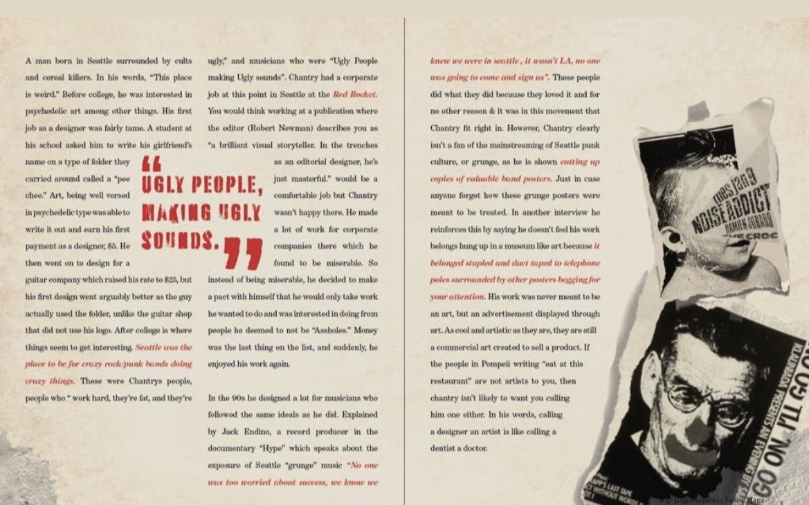
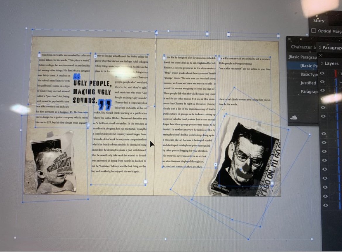
Cleaning Off My Desktop: During my college years, I had the privilege of studying the work of Art Chantry, a celebrated designer whose approach starkly contrasted with my own. I also had the unique opportunity to connect with Art through an interview conducted for this project, and I continue to follow his insights on Facebook, where he intriguingly begins each post with 'Cleaning Off My Desktop:' – a distinctive trademark for those familiar with his work.
Art Chantry's design philosophy encompassed aspects that I felt were distinct from my own journey as a designer. My introduction to the design world occurred in the 8th grade, where I honed my skills in Illustrator before ever delving into the realm of physical illustration. This divergence in my design journey enriched my perspective and expanded my creative horizons. As a result, I hold this booklet dear as a testament to my growth and evolution as a designer


We were tasked with designing a book for New Hope for Kid's annual report. New Hope was looking for a story, so I decided to tell them ours. During this time, I and my half-siblings were mourning the loss of our father. I pulled from my experience with my younger siblings to create visually how I saw their grieving from the perspective of an older adult in their life. The booklet would mostly be read by the parents or other adults, so I felt they would best respond to this.
The structure stands for the isolation a child may feel as they seem unreachable at the peak of their grief to the parent. The light symbolizes happiness, and a way to see through the darkness which represents this grief. Throughout the booklet, the child's lighthouse slowly illuminates the darkness around them as the foliage from the new hope logo scales the lighthouse to them. Representing how new hope comes into these families' lives to aid them in reaching their child and helping them to see past their current circumstances.

I worked with the Limbitless PR team to create a PDF that could be sent to companies around the country to introduce the Limbitless mission. I used images from the company archive and written content from the PR team to put together these pages to be adapted for future use.