

Hurricane Guide
Anticipating how our end users would typically access the booklet, I pitched an interactive PDF format. This allows users quick access to valuable information in an emergency and allows for ads with greater value to our clients.


With the introduction of Channel 8's fresh visual identity, the Hurricane Guide underwent a transformative update. Having been in circulation for numerous years, the booklet had evolved from print to digital while retaining elements reminiscent of its printed origins.
Anticipating how our end users would typically access the booklet, I pitched an interactive PDF format. This format empowers users to swiftly locate specific information and adapt to the county's newly established online communication channels for shelters and flood zones. These channels are seamlessly integrated within the booklet, offering convenient links to official county sources.
Given the digital-only nature of this booklet, I departed from conventional print paradigms. The absence of physical constraints enabled us to include all necessary information while maintaining an open and minimalistic design. This design approach aligns harmoniously with our brand identity, fostering a sense of calm essential for individuals preparing for hurricane season.
The updated format was met with enthusiasm within our team, and it also presented a unique opportunity for our sales team to offer clickable ads of higher value to our clients. The booklet's funding is predominantly derived from advertisements sold by our sales team, and we had the privilege of designing an ad for Hales (pictured) who generously supported this endeavor.


Art Chantry Designer Book
Art had a completely different outlook on the design world than I. He challenged me to push outside of my comfort zone. It was a huge milestone in my growth as a designer. What started as a disadvantage became a huge opportunity.
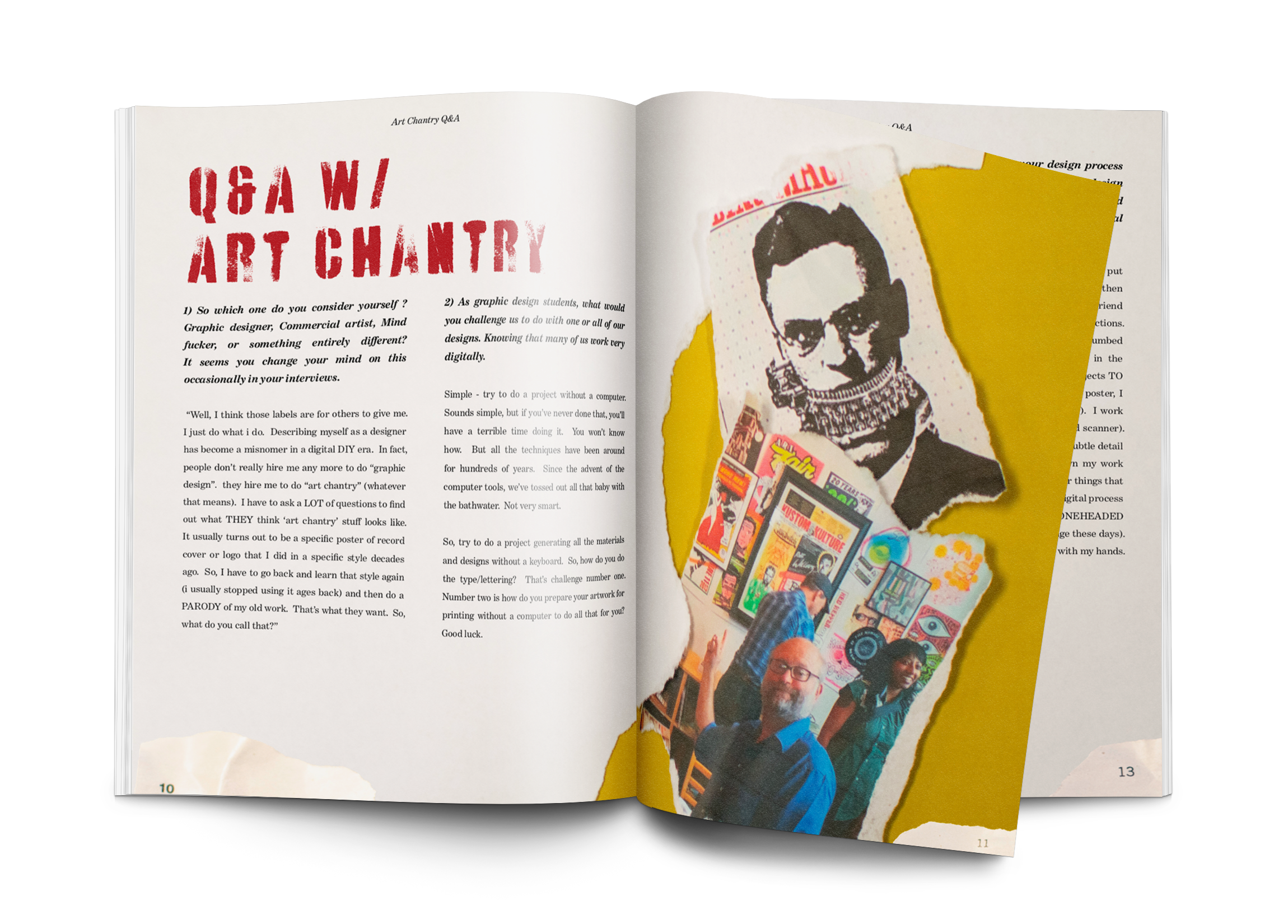

Cleaning Off My Desktop: During my college years, I had the privilege of studying the work of Art Chantry, a celebrated designer whose approach starkly contrasted with my own. I also had the unique opportunity to connect with Art through an interview conducted for this project, and I continue to follow his insights on Facebook, where he intriguingly begins each post with 'Cleaning Off My Desktop:' – a distinctive trademark for those familiar with his work.
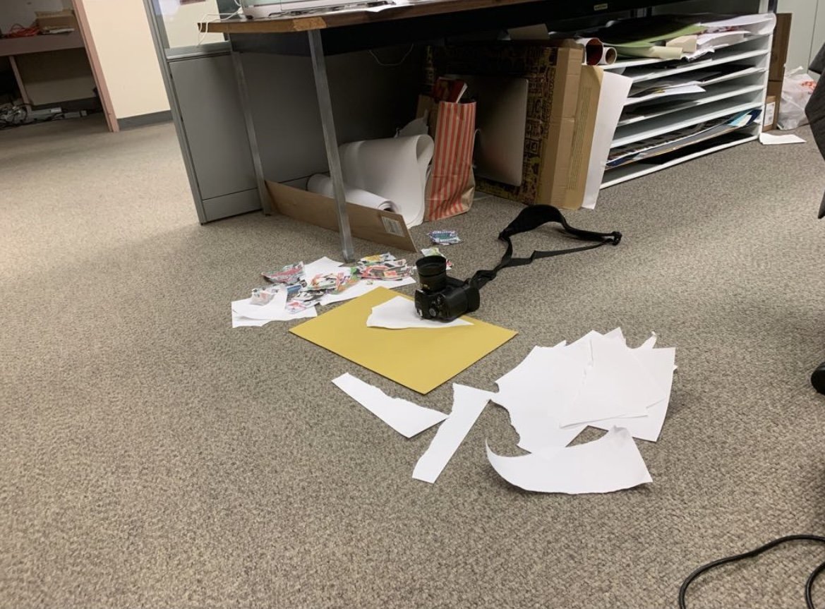
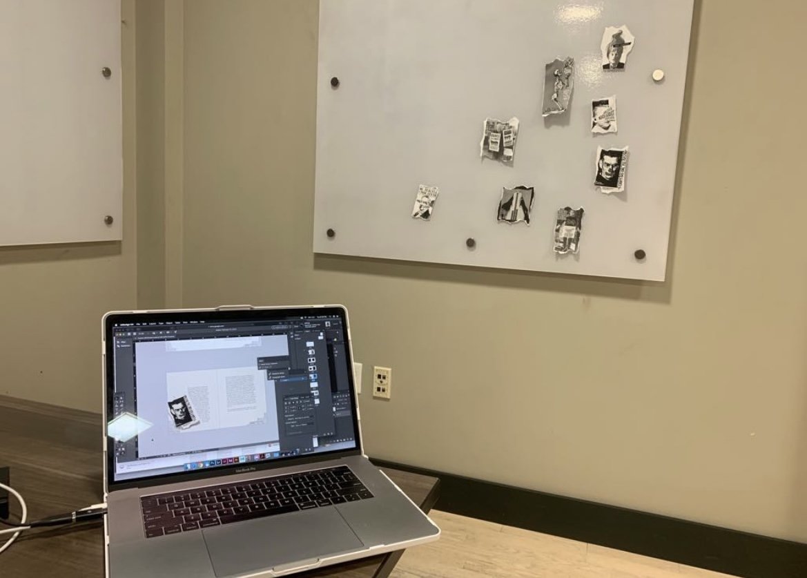
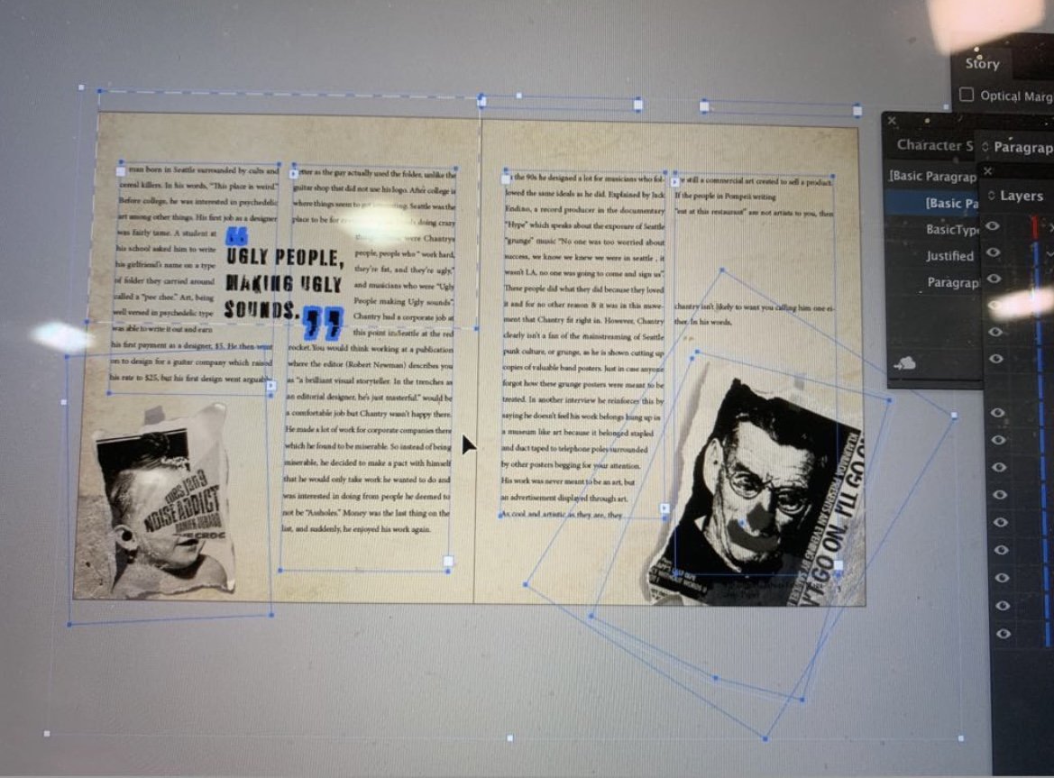
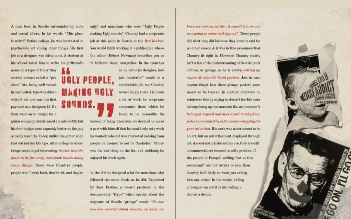
This booklet became a great example of how I faced and prevailed against an adversary in my work. As students, we created research papers on a designer, we then were assigned a partner to trade research with so that we could design booklets for our respective research papers- becoming familiar with two famous designers in the process. My partner had not completed the initial assignment, so I was faced with completing both parts of the assignment within the timeline allotted for one. When I realized how tight the time crunch was, I requested an extension from my professor which was declined. So I got creative - I found Art Chantry online and crafted questions I thought would grab his attention. It worked, I received the information I needed in a quicker timeline that allowed me to complete the project on time.
What started as a disadvantage became a huge opportunity. The project was intended to be a combination of our style with our respective designer and I now had direct communication with mine. Art gave such unique perspectives on my work. Coming from a time before computers, Art had a completely different outlook on the design world than I, who started learning the Adobe programs before I learned to draw & had my own computer by the age of 4. He challenged me to push outside of my comfort zone and to truly commit to the purpose of the project, truly infusing his style into my own. In the end I created one of my favorite projects from my college experience, which as someone who attended college explicitly for the dream of being a layout designer, was huge.