Branding
Todo Tampa Bay Brand
Concept one
Todo Tampa Bay represents our unique eveningside counterpart to the Bloom and Daytime programs, providing viewers with an exploration of Tampa Bay under the enchanting evening sky. In line with the approachability and openness characteristic of these shows, our objective was to cultivate a welcoming brand identity.
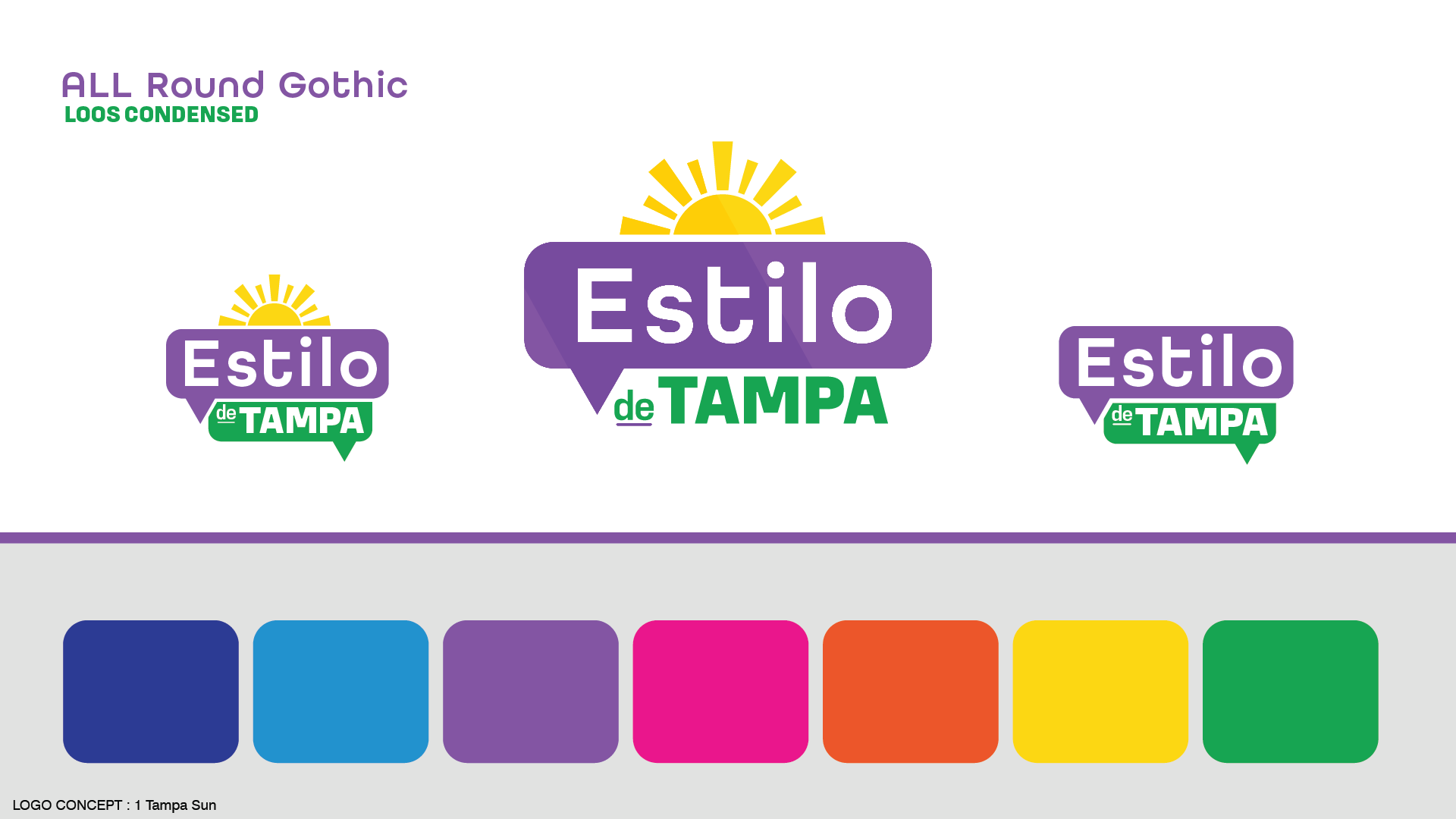
To bring this concept to life, I honed in on the sensation of discovering a tranquil oasis amidst the bustling nightlife of Tampa. I envisioned a serene alleyway bathed in the soft glow of neon lights, which served as the muse for a custom-designed font reminiscent of classic neon signage.
Integrating elements specific to downtown Tampa living, I seamlessly incorporated the iconic river that graces our cityscape, weaving a wave form into the typography. Finally, I captured the essence of the show's timing with a picturesque beach sunset, where the circular motif symbolizes the sun, while the river within the font serves as a dual representation of our beloved Florida beaches.
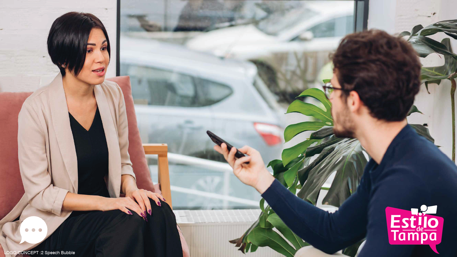
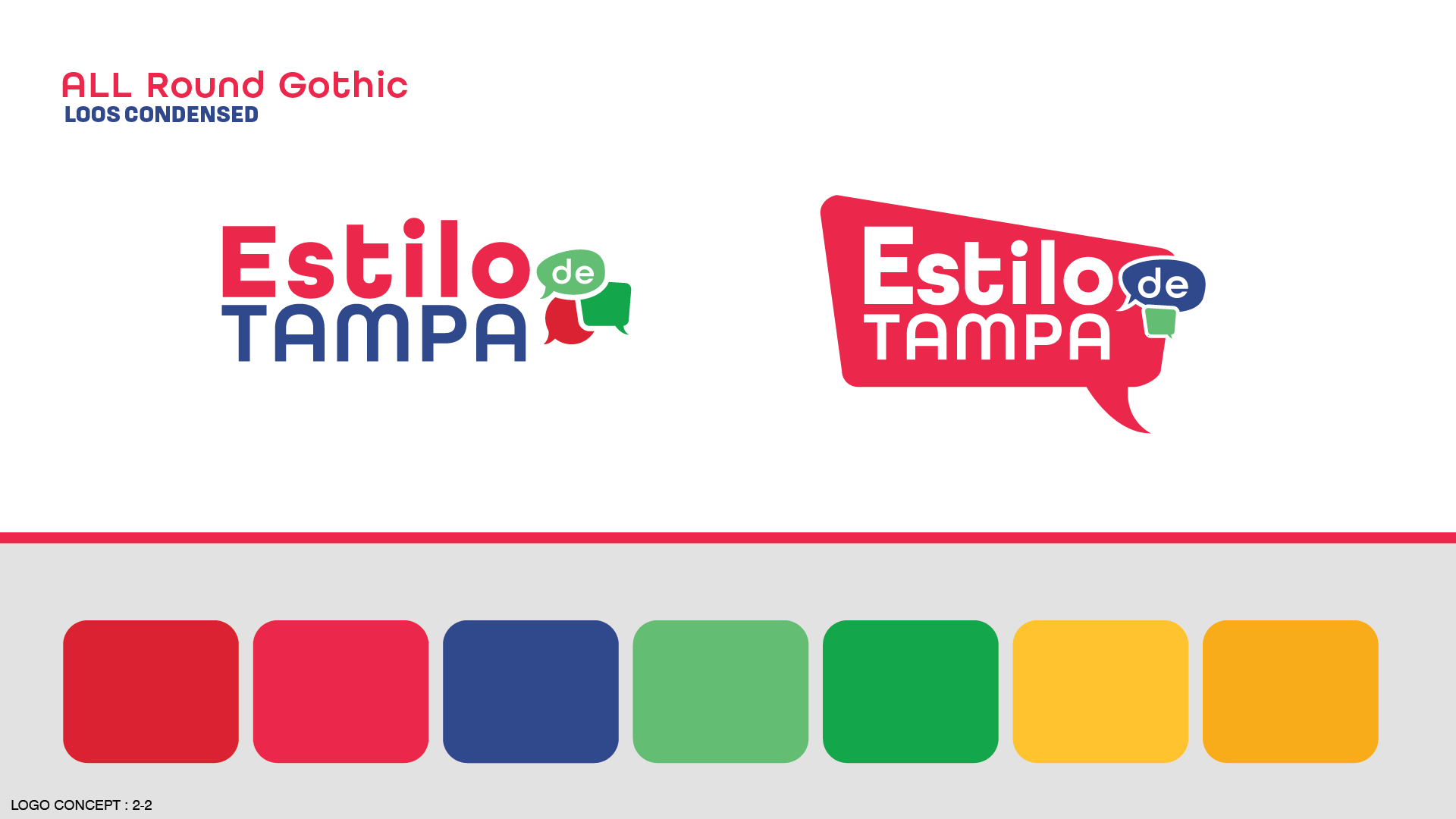
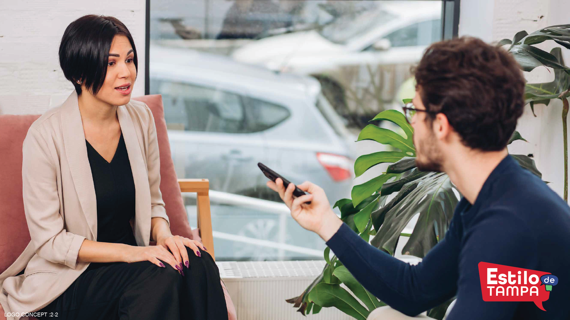
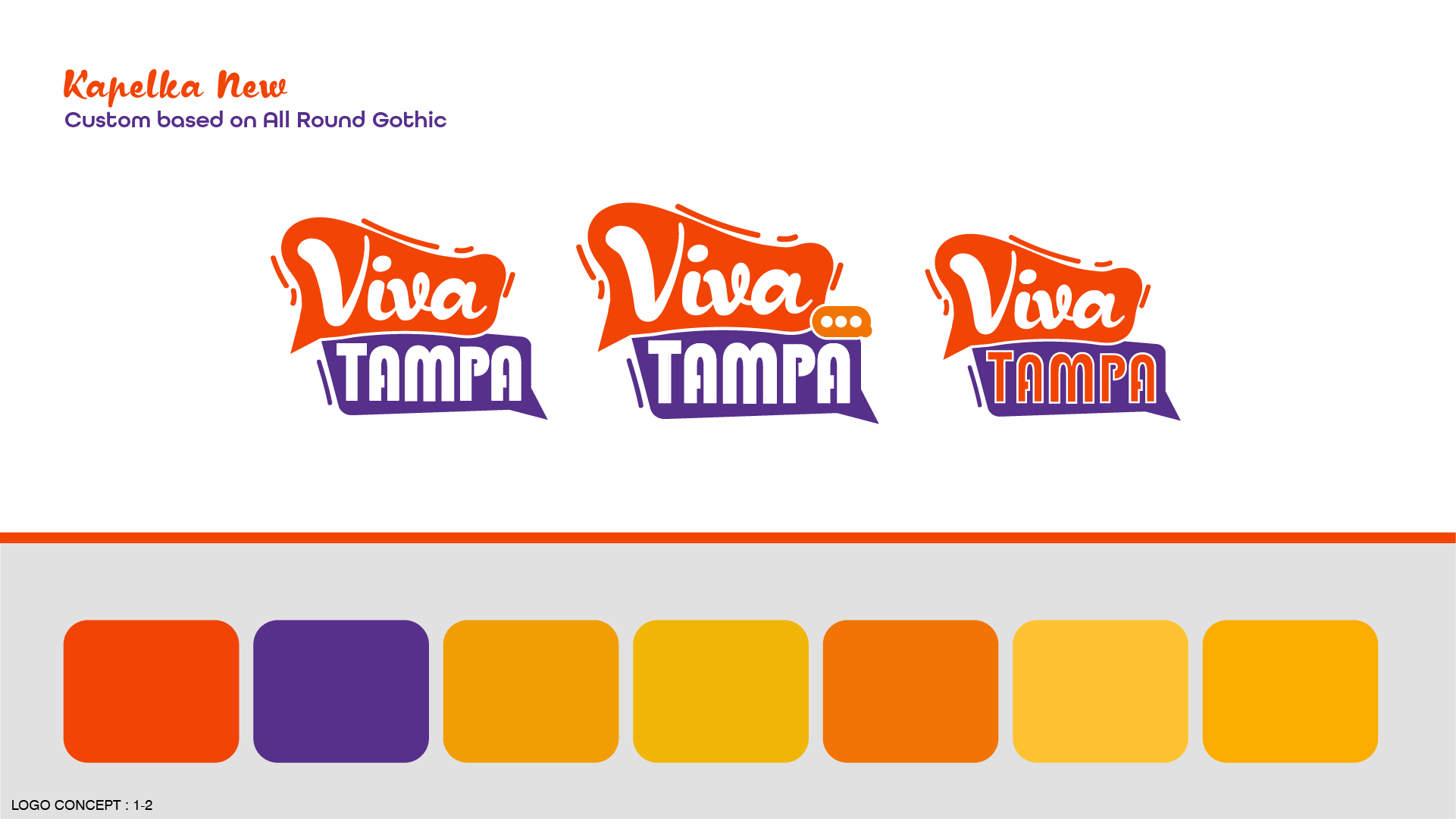
Concept Two
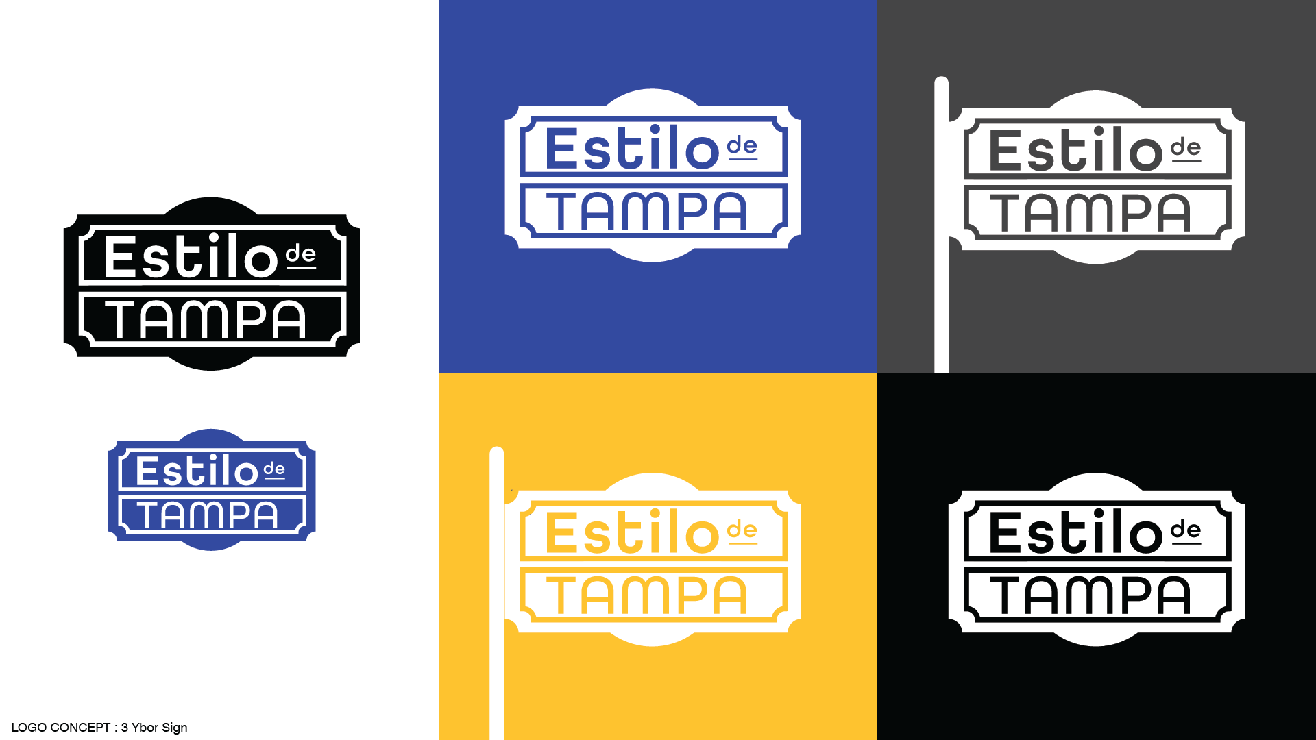
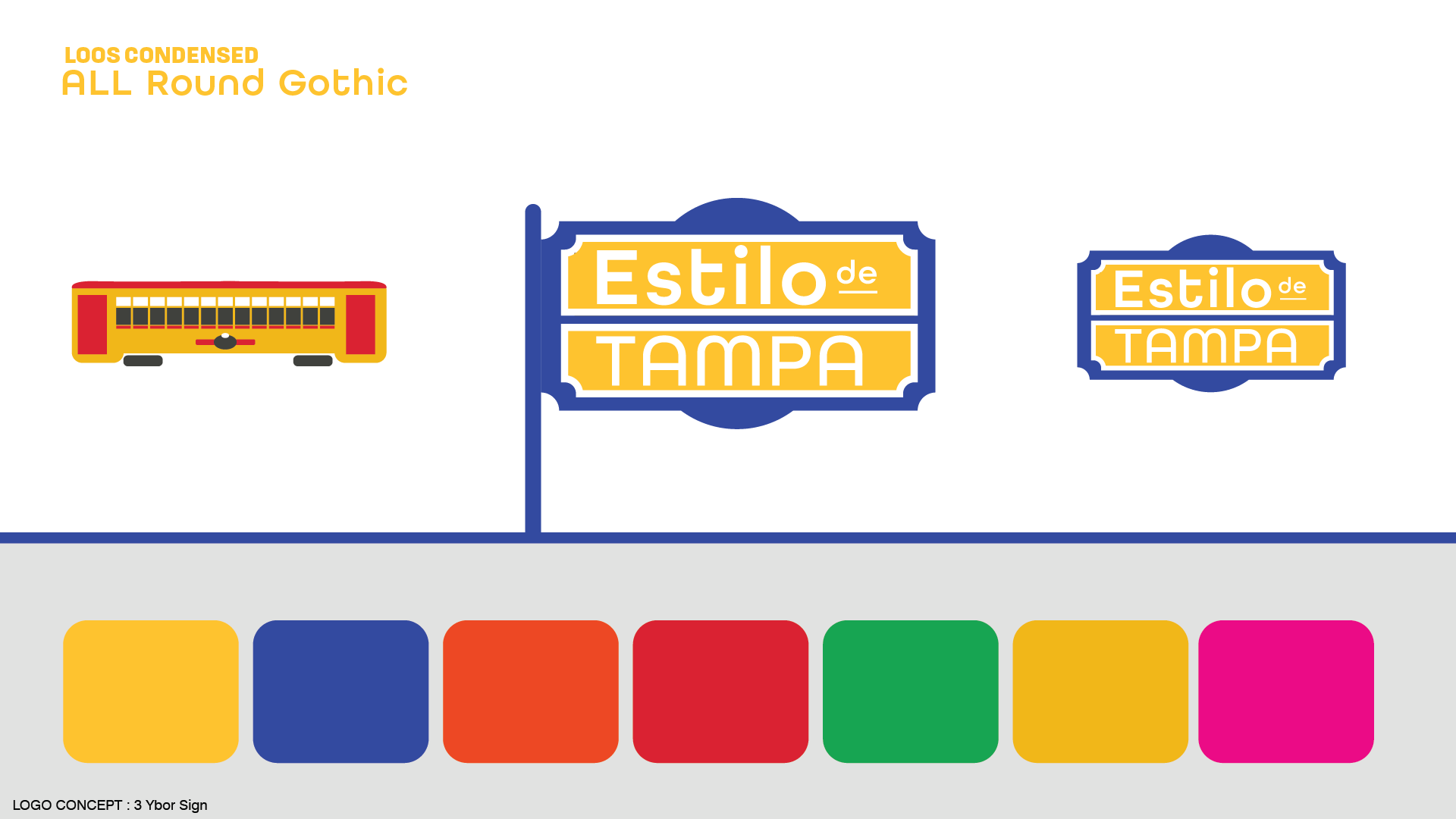
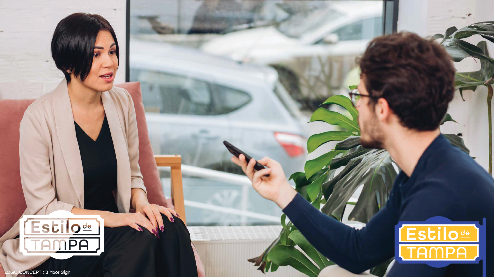
Our management had expressed a desire for options that expressed an emphasis on the linguistic aspect of the show. To maintain continuity, I retained the vibrant colors discovered through extensive research into typical color themes within Hispanic cultures.
In my creative exploration, I delved into the realm of speech bubbles, aiming to imbue them with a personality that resonated with the dynamic energy of the show. Ultimately, speech bubbles emerged as a compelling choice, as I wished to avoid overly emphasizing Spanish culture in conveying the essence of the Spanish language. While culture remains an integral aspect of the Spanish language, I wanted to steer clear of any misperception that the show was primarily about Spanish culture, as its core identity aligns more closely with that of Daytime but in Spanish.
Mood Board
Condensed Sketch File

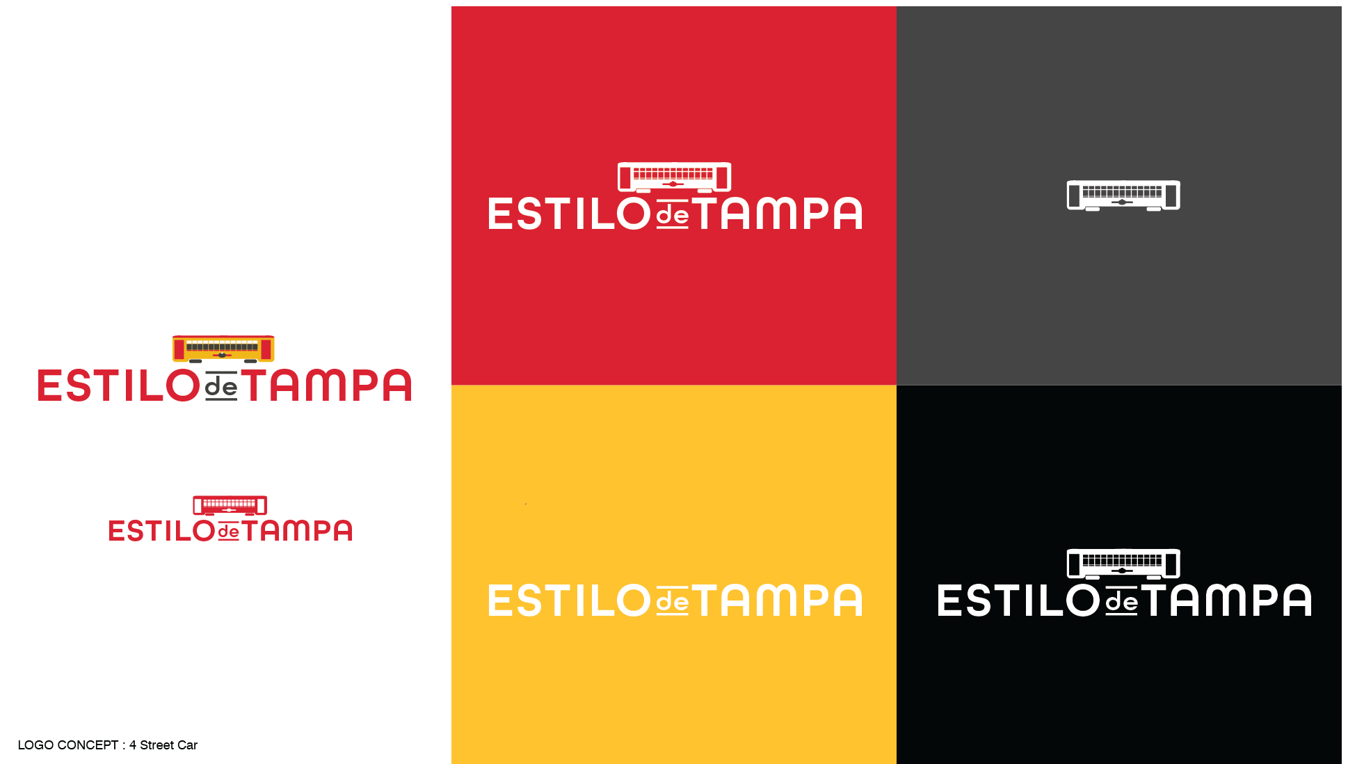
First Round Logo Presentations


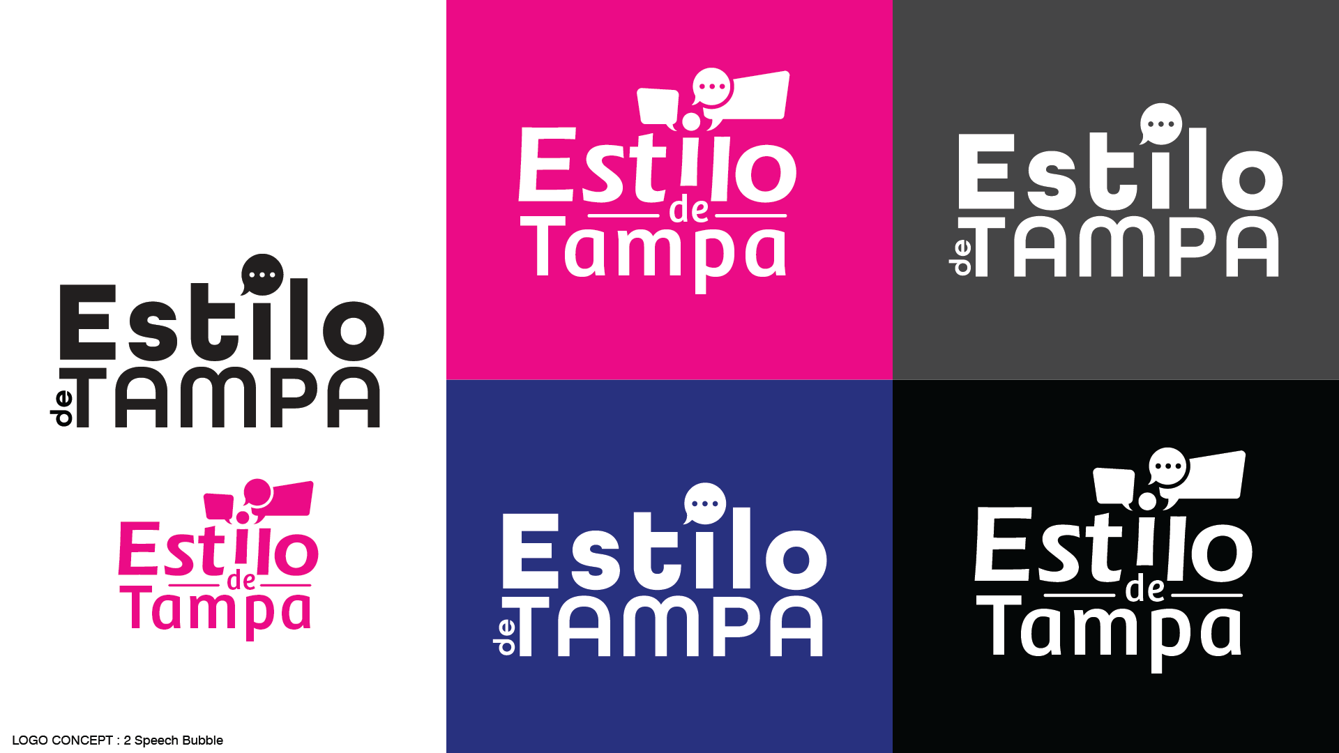

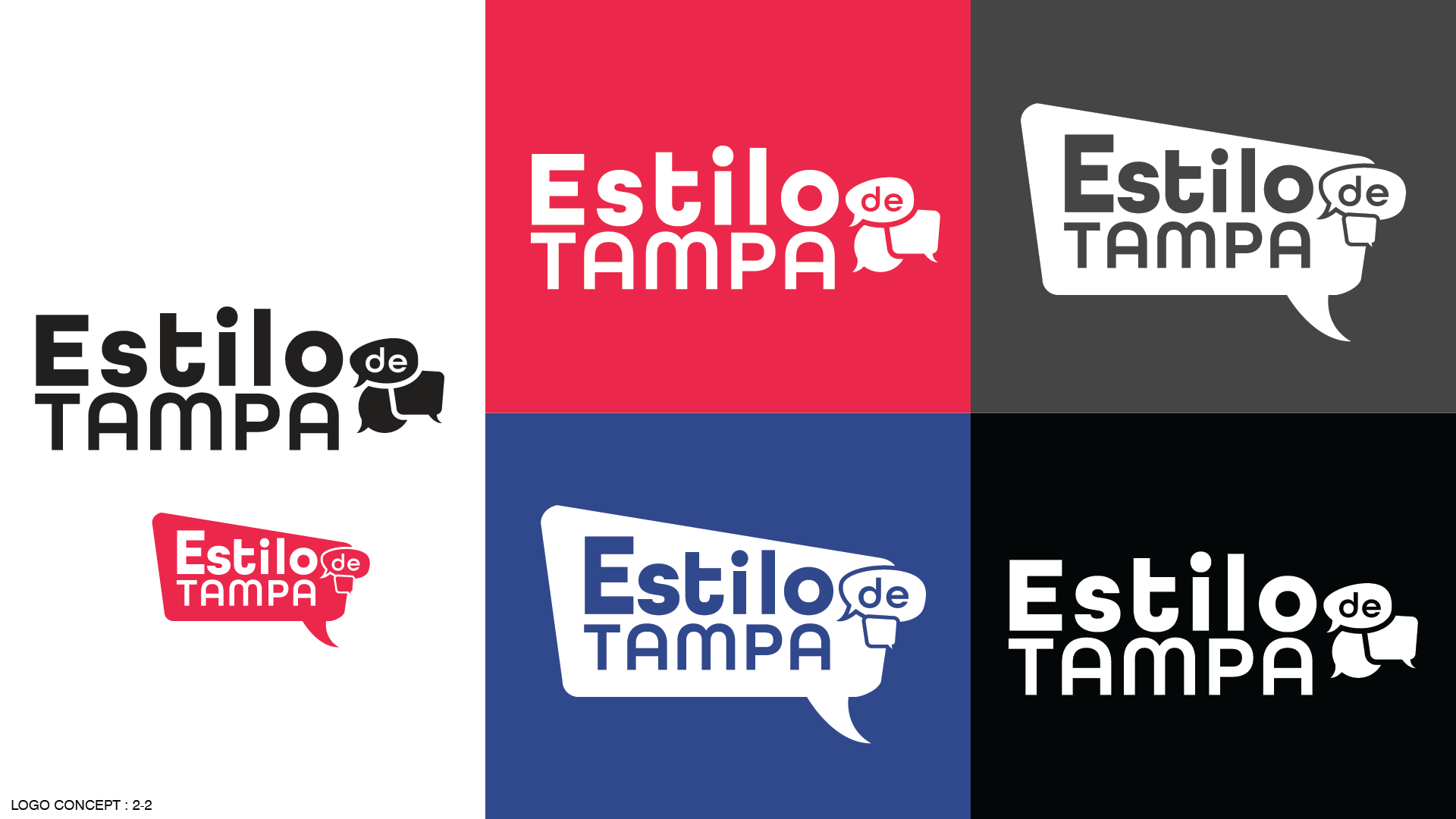


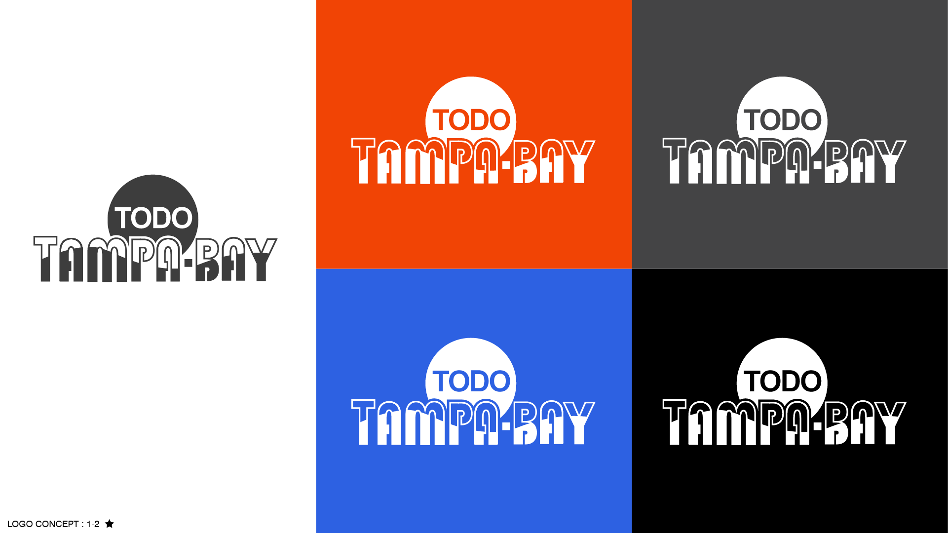
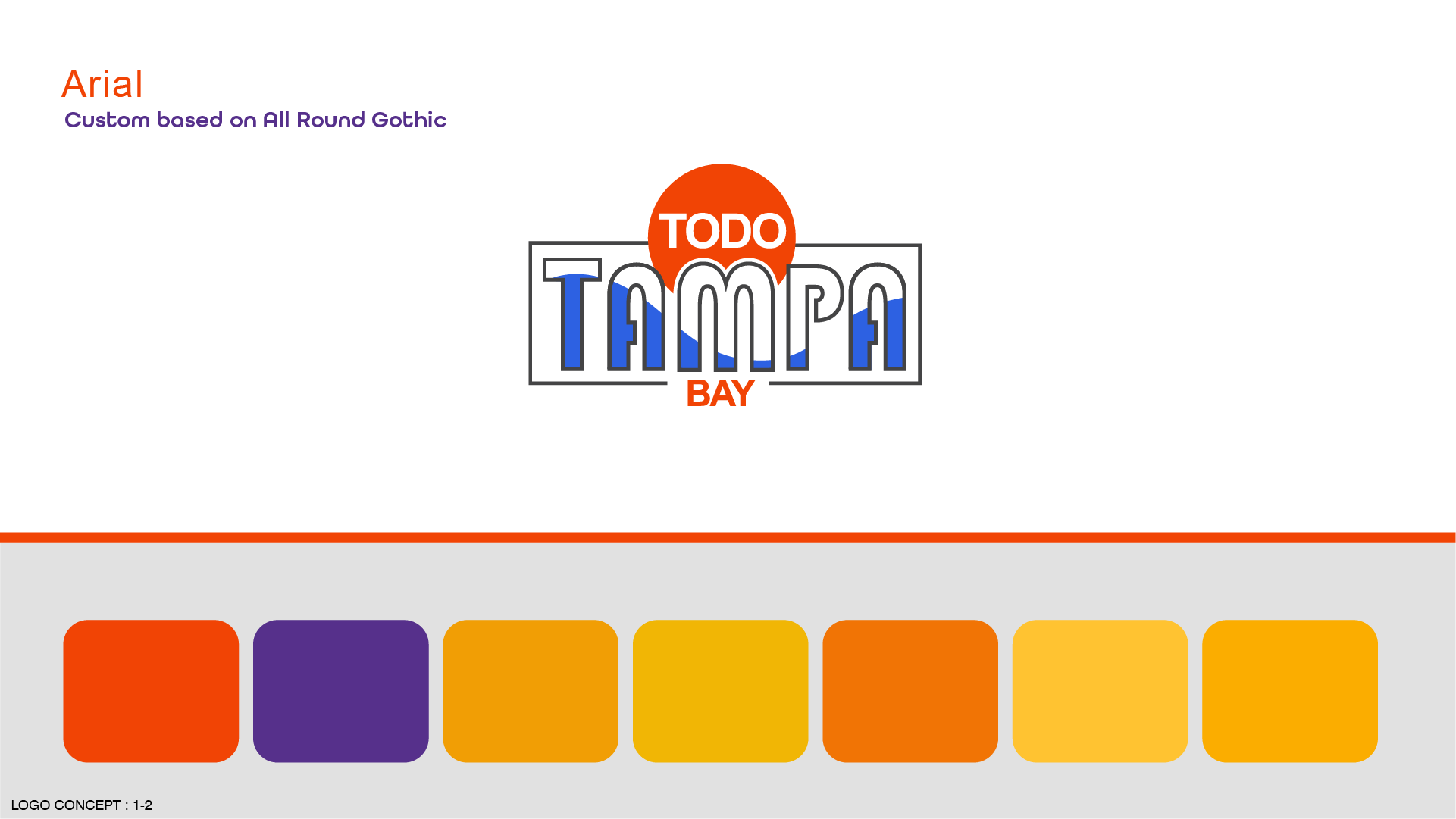
Second Round Logo Presentations


Blood Drive Brand
Concept
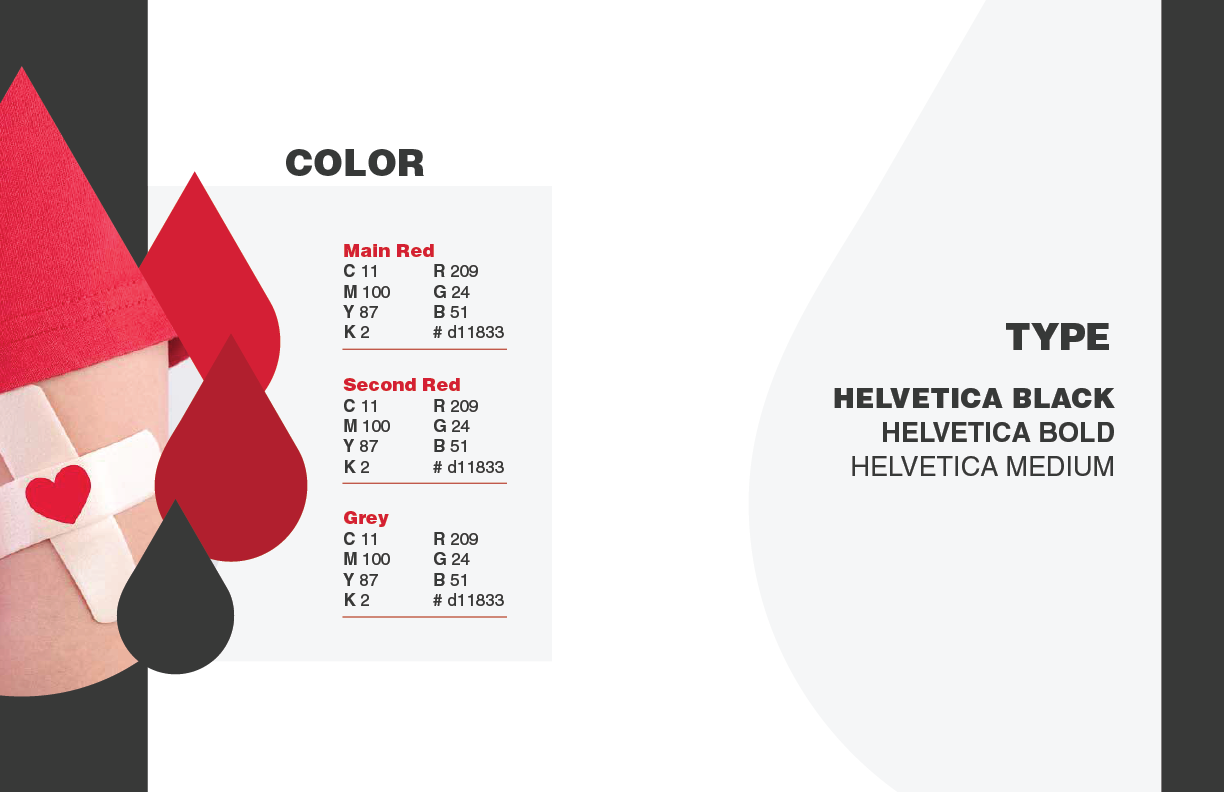
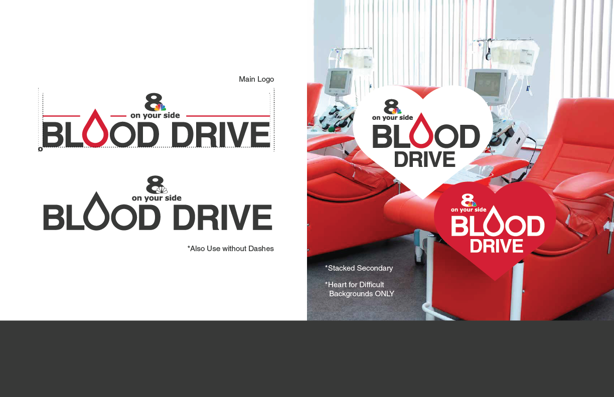
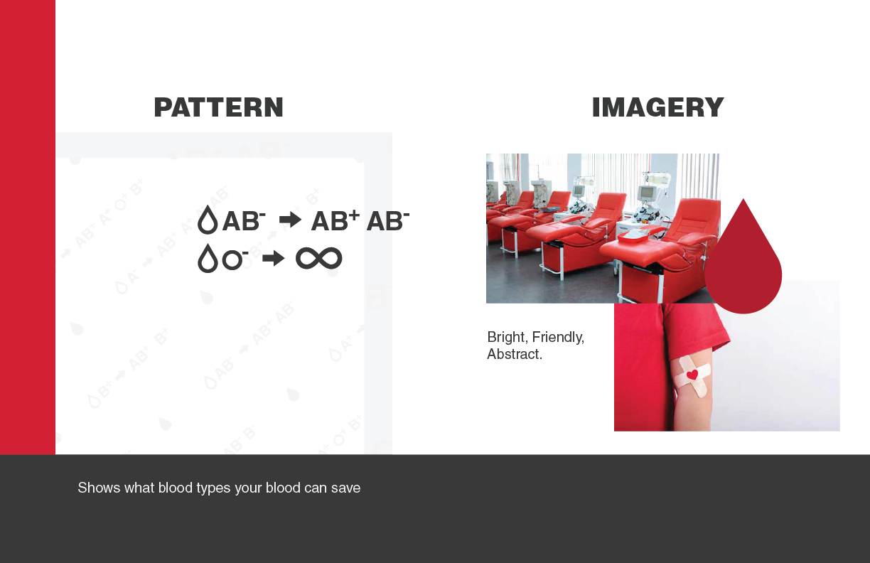
I was entrusted with the task of designing an entirely new visual identity for the 8 On Your Side Blood Drive. Commencing with a minimalist text treatment, I embarked on a creative journey aimed at crafting a more personalized and engaging aesthetic for this important initiative. Given that the heart of the event lies within the community, I sought to incorporate the blood types and their respective recipients into the design, symbolizing the diverse members of the community rallying to support one another.
To further enrich the visual narrative, I constructed a patterned background featuring various blood types, seamlessly integrated into the overall look. Once these elements were designed, I leveraged mockups to create set graphics, specifically tailored to the location chosen by producer, Matt Larson.
Upon completion of the shoot, I assumed responsibility for audio integration and final editing, meticulously overlaying fullscreen graphics, as exemplified in the image provided.

The Before
This project holds a special place in my portfolio because the recurring nature of the event provides the opportunity to showcase my creative process and the tangible impact of my work. Year after year, the same producer, working within the same parameters and timelines to produces a promotional video for the Blood Drive event. The remarkable aspect of this project is that while the core elements remain consistent, the evolution lies in the addition of my graphic design work, which served to refresh and elevate the promotion.
Run For Fun Brand
Logo Presentations


Sioltea


Concept
Sioltea is a concept for a tea brand inspired by sustainability. I love a cup of tea and over time I have become more specific about my tea consumption based on research for my personal photography work. I’ve always been fascinated by zero waste living. Now I generally purchase loose leaf tea and attempt to recycle the cardboard box, but before that most of my tea consumption before that came in tea bags or even glass/plastic bottles. My goal for Sioltea was to begin thinking of ways we could still enjoy products without the concern of being wasteful by focusing on something I personally had put a lot of thought into, tea.