Bloom
Bloom is a health-centric brand dedicated to fostering well-being throughout the Tampa Bay region. Our tagline, 'Mind Body & Soul,' serves as a guiding principle, encapsulating the core themes addressed within the program's content. Our focus is on holistic health, encompassing areas such as wholesome dietary practices, mental well-being, and enjoyable fitness routines.
In my capacity as the Lead Designer, I bear the responsibility for overseeing all design-related endeavors integral to the brand. I invite you to peruse the array of elements I've created over the past three years, which collectively contribute to the visual identity and impact of this brand.
-
The evolution of the Bloom brand was driven by a shift in our show's intended personality. Originally poised to center around medical aspects, Bloom underwent a transformation towards a more comprehensive focus on holistic health. To align the brand with this new vision, I initiated a comprehensive brand update. Drawing inspiration from modern architectural principles, I aimed to create a timeless aesthetic infused with organic elements that seamlessly integrated with our logo's curves.
The color palette was revitalized to infuse vivacity into the visual identity, fostering an environment of excitement and enjoyment. My deep familiarity with the team and the show's ethos enabled me to appreciate our commitment to providing viewers with a safe and soothing space. In line with this vision, we embraced spa-like imagery, incorporating elements like yoga that harmoniously encapsulate the brand's core values. The incorporation of wood textures, already associated with these themes by our viewers, further reinforced the serene and calming ambiance we sought to convey.
-
At the core of the Bloom brand is our on-air show, where our esteemed host, Gayle Guyardo, engages with health and wellness experts in the Tampa Bay Area, dedicated to nurturing the well-being of our community. In my capacity as the Lead Designer, I play a pivotal role behind the scenes, shaping the show's visual identity and brand.
My responsibilities encompass the creation of templates within Ross XPression, a pivotal resource for our producers, which are essential for daily operations, including elements such as full-screen displays and lower-thirds. Additionally, I provide comprehensive design support for a diverse range of platforms, spanning social media, digital, print, and more, ensuring a seamless and visually cohesive representation of the Bloom brand.
-
The Bloom Health Expo represents an inclusive community engagement initiative, offering the opportunity for individuals to experience Bloom firsthand. In collaboration with esteemed partners, Advent Health and the Tampa Bay Buccaneers, we orchestrate a transformative event dedicated to fostering well-being.
Our joint efforts, bolstered by the involvement of former Buccaneer Martín Gramática, culminate in a dynamic event designed to captivate attendees of all ages. Advent Health plays a pivotal role by providing vital lifesaving education. The Expo is strategically located at the Advent Health Training Center, conveniently situated on the Buccaneers' campus.
In my role, I provided essential design support across various facets of the Expo, including the creation of maps, signage, digital assets, and more, all contributing to the seamless execution and visual cohesiveness of this transformative event.
-
BloomTampaBay.com serves as the online hub for all things Bloom. My role includes the creation of web advertisements for clients who do not supply their own assets, in addition to fulfilling any other graphic design requirements necessary to maintain the website's seamless functionality and visual appeal.
-
The Bloom Health Club represents our dedicated streaming show, and in collaboration with streaming expert JB Biunno from WFLA, I am responsible for the creation of tailored graphics designed specifically for streaming purposes.
Mind . Body . Soul
-
Mind . Body . Soul -
Bloom Open
I undertook the task of creating the Bloom show's opening sequence, driven by the desire to deliver a distinctive look, setting it apart from other show openings.
Throughout this creative process, my emphasis lay in leveraging vibrant imagery and a dynamic color palette to craft an attention-grabbing opening that would truly stand out. It was a moment of great satisfaction when Gayle expressed her contentment by likening the graphics to the standard set by the Kardashians, not necessarily in a comparative sense, but as a testament to the comfortable and enjoyable working environment we aimed to provide her every day.
Bloom TV Show
-
![]()
Brand
The essence of the Bloom brand revolves around radiating a sense of happiness, vitality, and tranquility. Bloom aspires to serve as a secure and welcoming haven for viewers, fostering an environment where they can explore and actively engage with a wide array of health-related topics.
-
![]()
Set Graphics
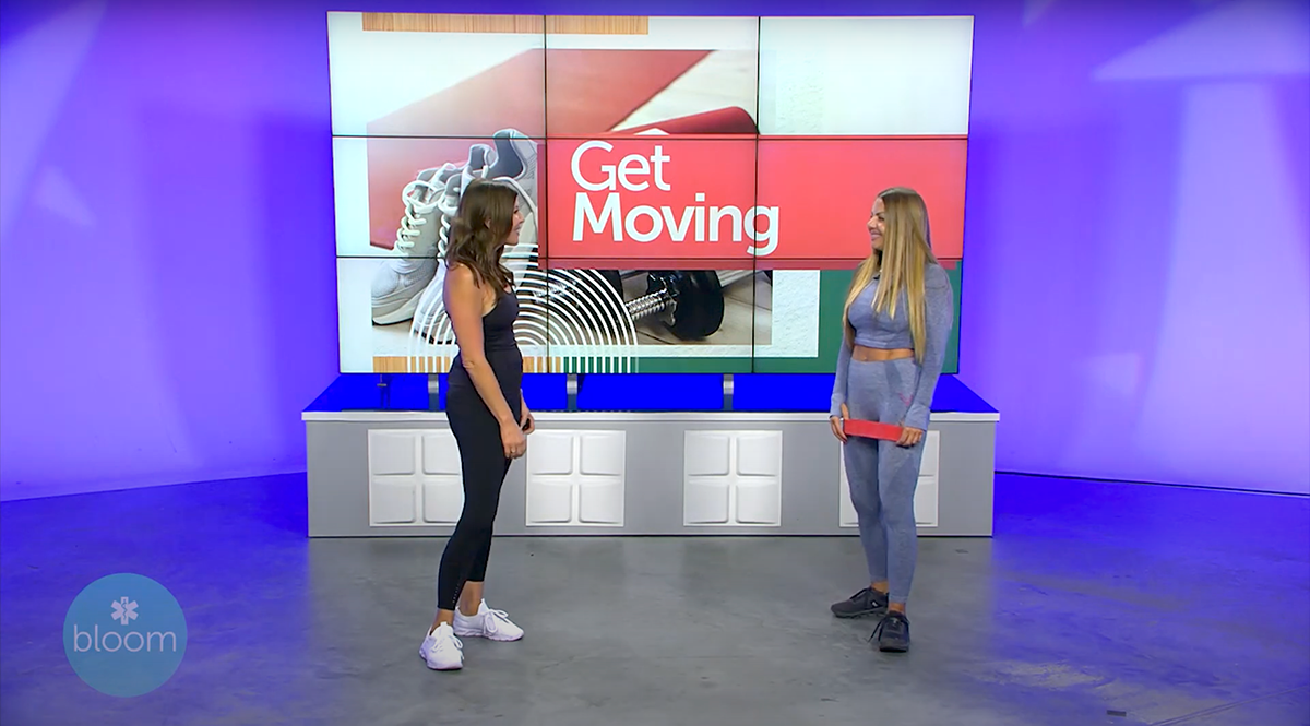
A pivotal facet of television design revolves around our set graphics. Within the programming studio, our setup includes multiple monitors, reminiscent of our news set configuration. The image below showcases a monitor graphic tailored specifically for our 'Get Moving' segment, an integral part of the show where Gayle explores innovative approaches to staying active.
-
![]()
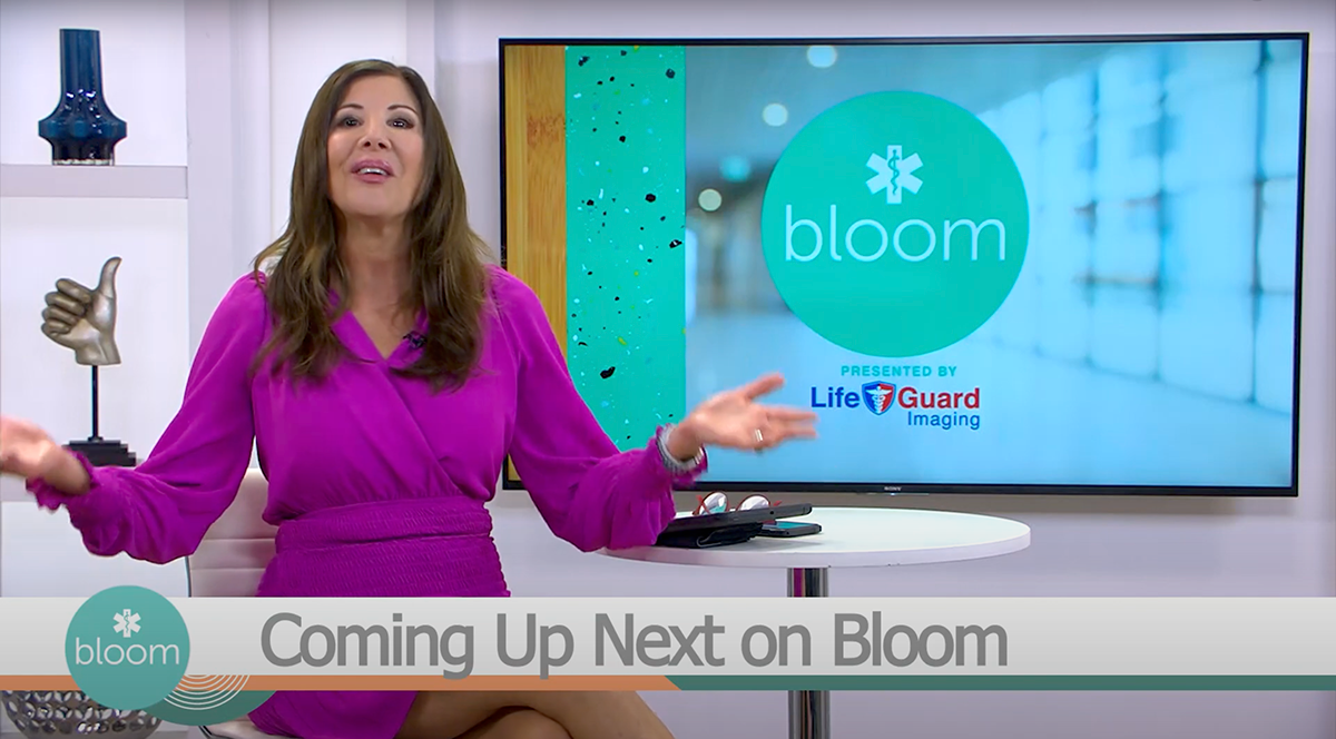
Interview Set
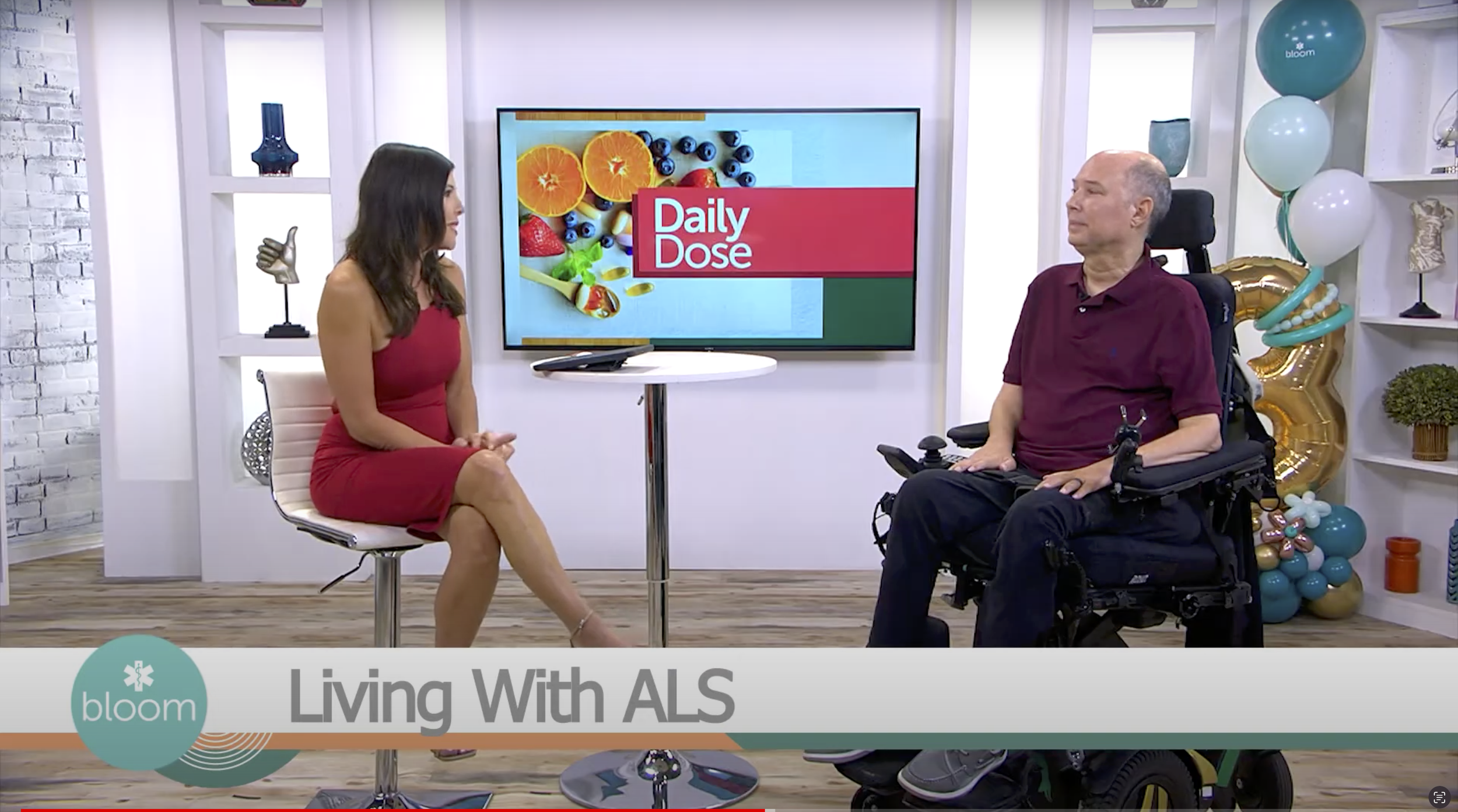
Beyond the workout segment, we transition to our interview segments, which feature a more compact monitor configuration. Below, you can see our default monitor display, prominently featuring the Bloom logo and our valued sponsor, Life Guard Imaging.
In addition, pictured is our lower third, a crucial visual element in our production. These lower thirds are expertly crafted either by our directors in Premiere, utilizing the lower third animation I created, or seamlessly integrated through our real-time graphics system.
-
![]()
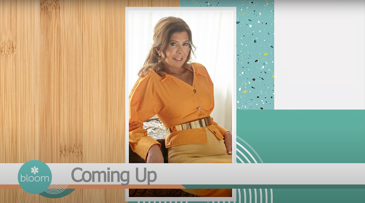
Image Fullscreen
Efficiency is key when working across multiple stations simultaneously, and an important component of streamlining our graphic creation process involves leveraging our real-time graphics system, Ross Xpression. As the lead Bloom designer, I craft versatile graphic templates within Xpression that empower our producers to make real-time edits seamlessly.
This example is an illustrative image template, meticulously designed to facilitate a user-friendly experience. Producers can effortlessly drag and drop new images into the template, which will dynamically respond as programmed, ensuring a consistent and polished on-air presentation.
-
![]()
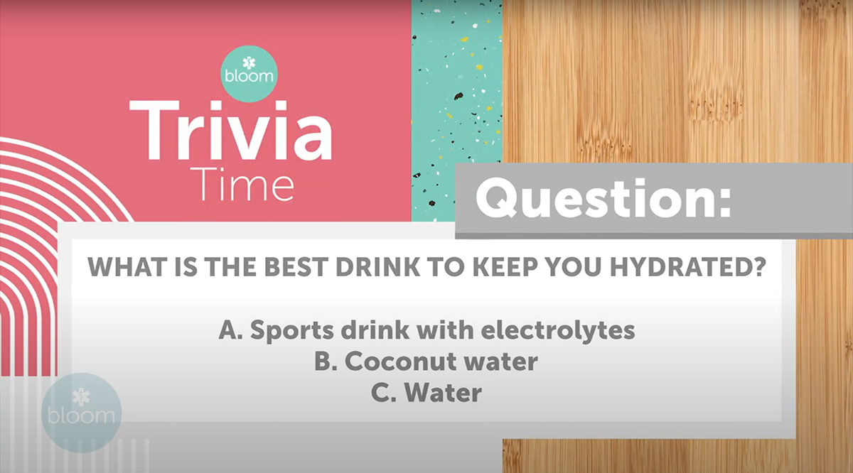
Trivia / Game Elements
Both Daytime and Bloom delight in incorporating engaging game elements into their respective shows. Pictured above is the trivia segment featured in Bloom. As part of my role, I create interactive templates within Xpression that empower our team to make real-time adjustments to these game elements. For instance, in this trivia segment, producers have the capability to change the text within the designated white space to craft new questions, ensuring a dynamic and interactive viewer experience.

Bloom Episode
This special segment marks the culmination of our efforts, commemorating Bloom's third birthday and standing as one of the initial episodes following our brand refresh. Designing for these shows is particularly exhilarating due to the diverse range of topics we can introduce to our community. Our commitment to fostering acceptance and accessibility is driven by the power of education, and it's truly inspiring to witness our dedicated team playing a pivotal role in this endeavor.
Bloom Promotion
A promotion was needed to inform viewers about the transition from Great 38 (now the CW Tampa bay) to News Channel 8. This was the first exposure our viewers had to the new look.
Expo Elements
-
![]()
Autograph Cards
-
![]()
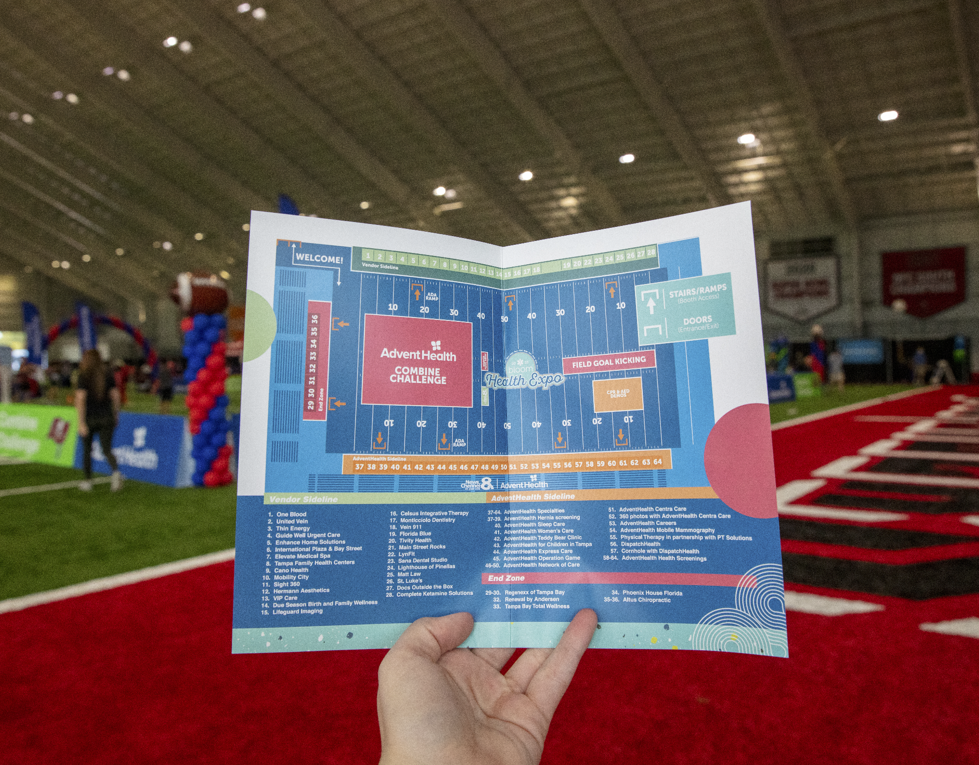
Map / Brochure
-
![]()
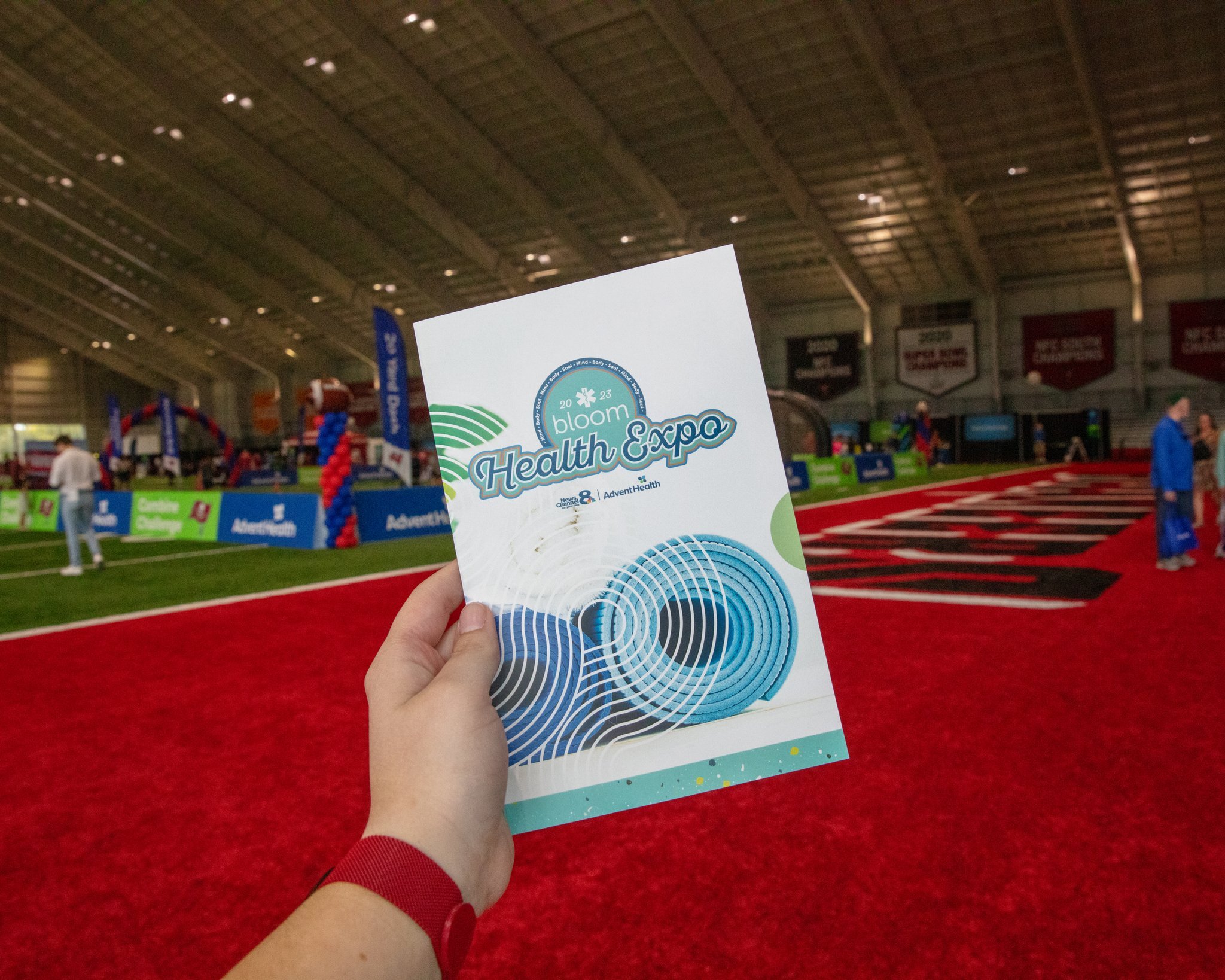
Cover Brochure
-
![]()
Signage
-
![]()
Booth Sign
-
![]()
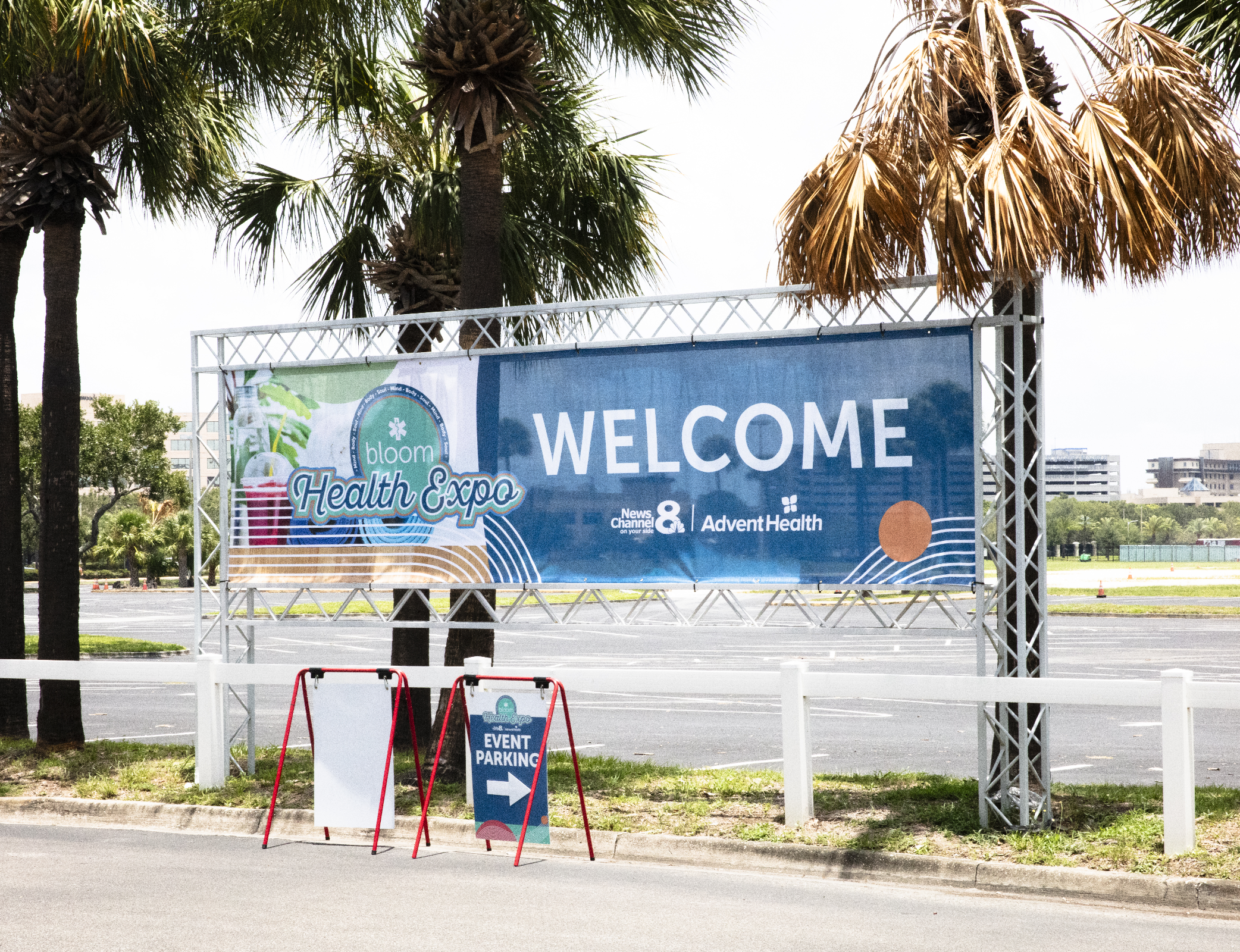
Welcome Banners
-
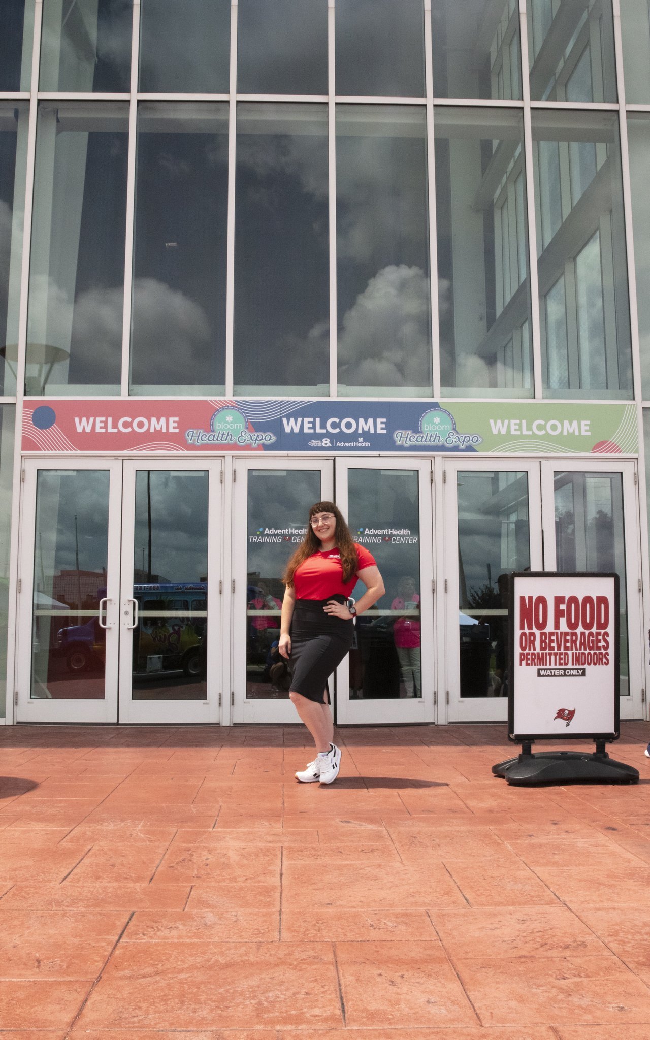
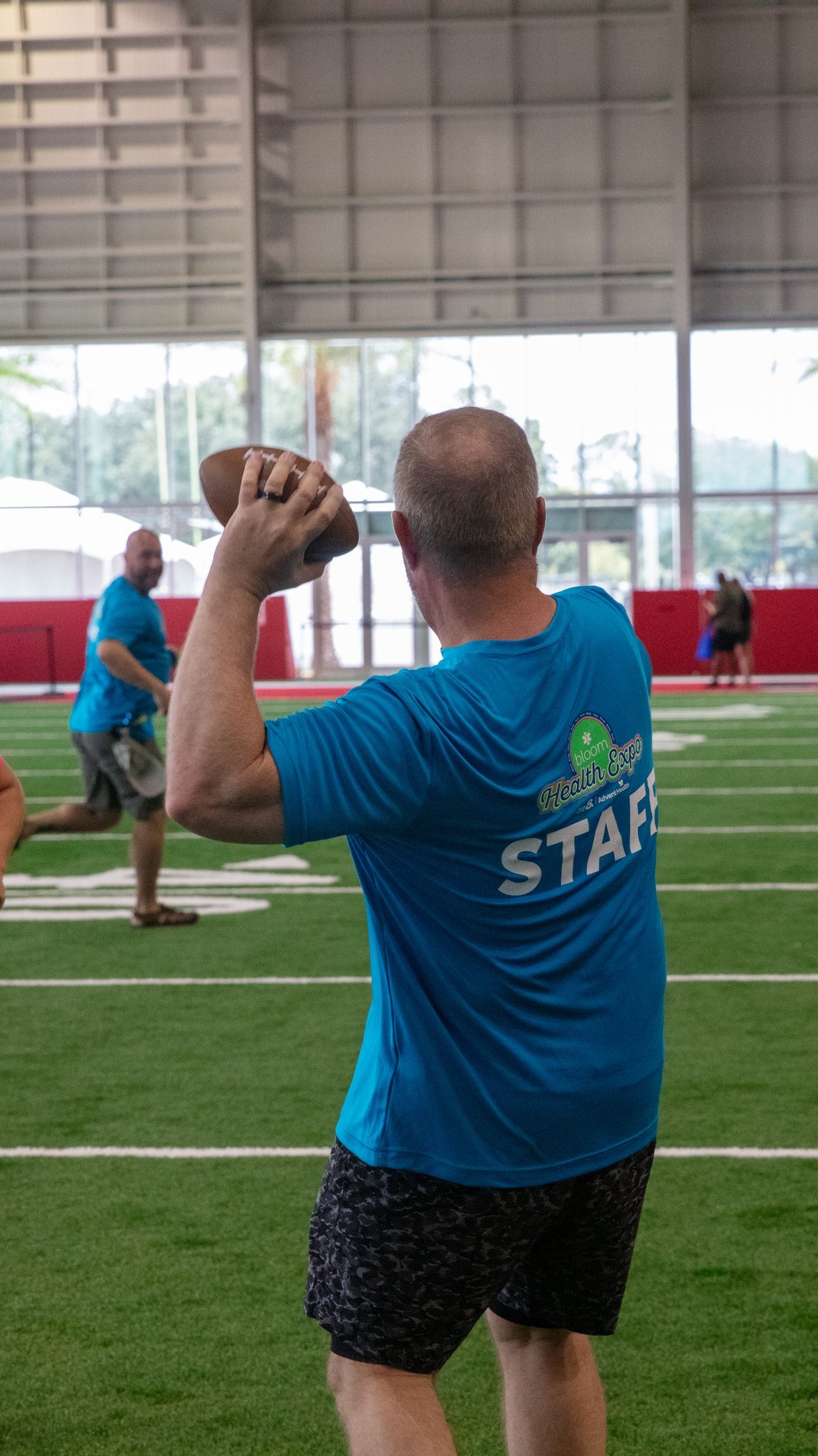
![]()
Blue Staff Shirts
-
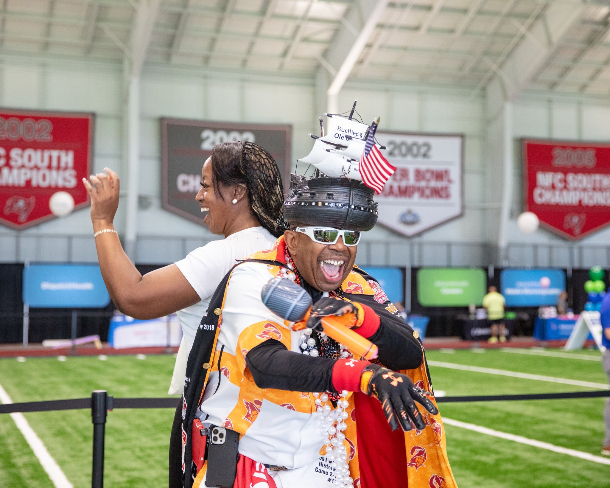
![]()
Event Photography
-
![]()
Enter Sign
-
![]()
Pink Staff Shirts
-
![]()
Vendor Photography
-
![]()
Logo Concepts
-
![]()
Broadcast Promotions / Final Logo


Bloom Health Expo Promotion
As the inaugural Bloom Expo, our promotional efforts leaned heavily on graphics to convey our message effectively. This presented a fantastic opportunity to showcase the Bloom brand in action, highlighting its visual identity.

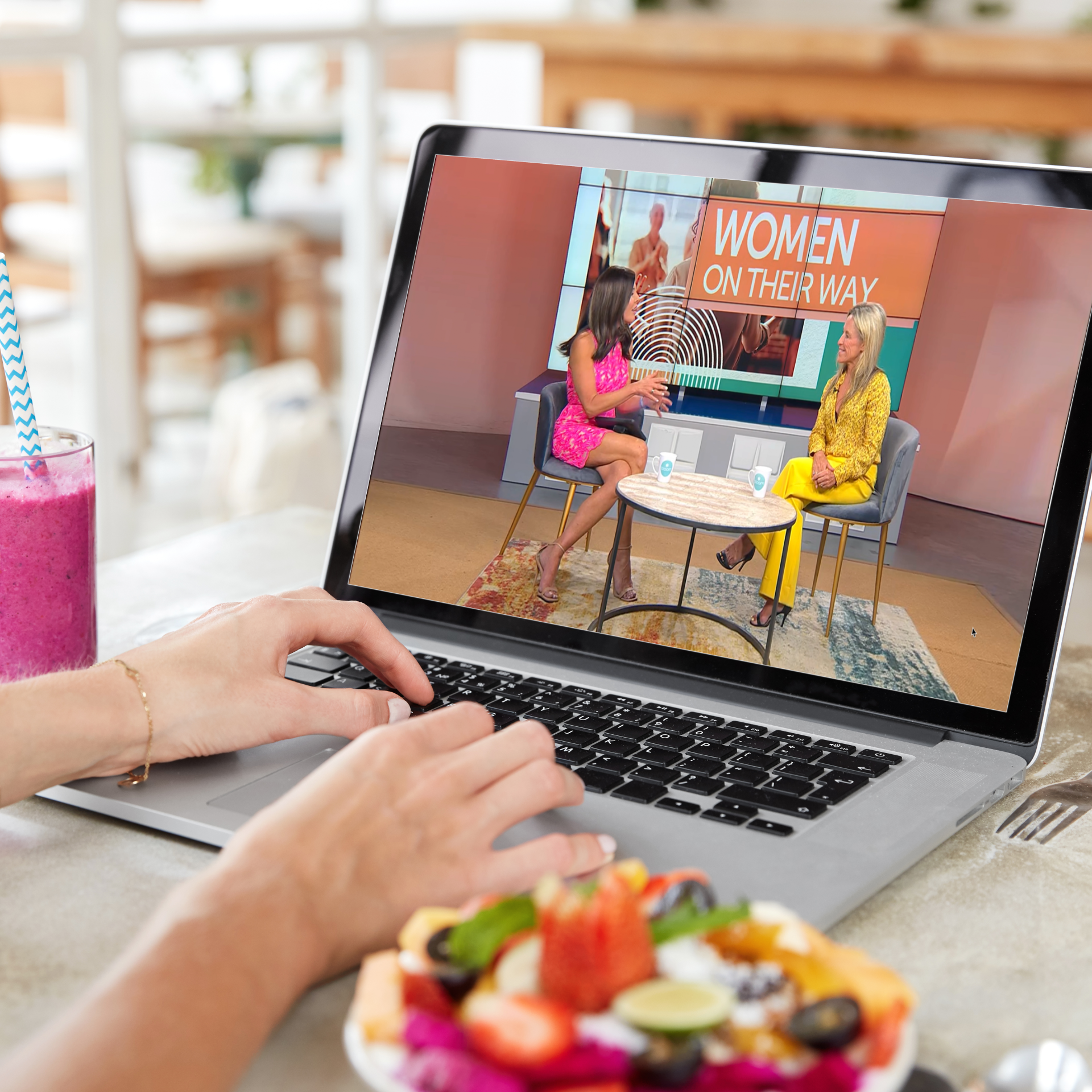
Bloom Online
-
![]()
Watch Bloom Online
-
![]()
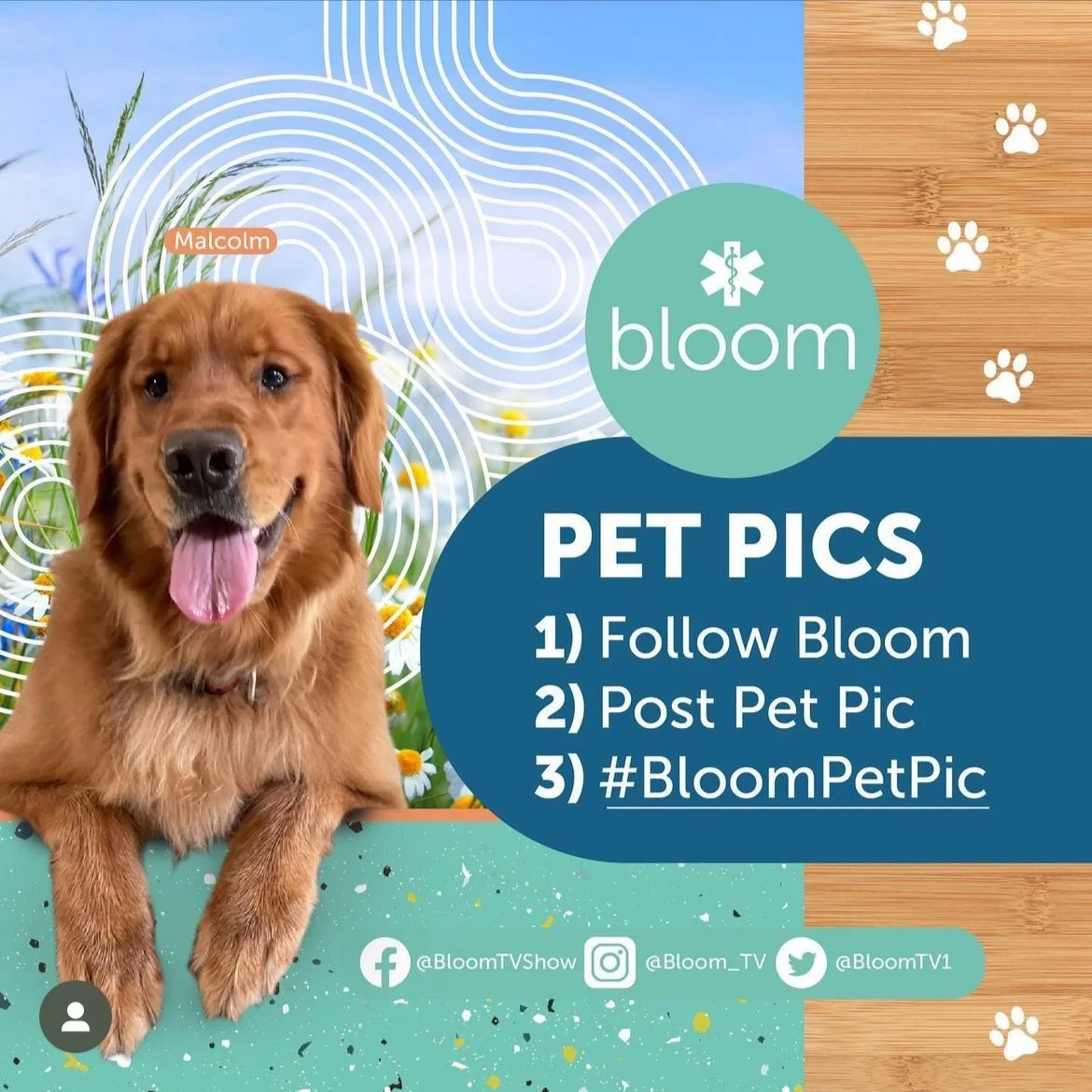
Social Posts
-
![]()
Social Posts
-
![]()
Bloom Socials


Bloom Health Club
The Bloom health club tops our digital efforts, spearheaded by stream expert JB, our team creates a live show that mimics the traditional TV format. Here is the first episode of that initiative.
Where we came from
To give an idea of how the brand has evolved since I took lead here is a very early episode of Bloom in the prior look. I have taken great care to evolve the look without completely loosing our roots. The diagonal lines became an organic curved, the transitions became more art deco inspired, and the imagery became more modern. Most importantly, with the establishment of a cohesive style guide the brand has become more consistent across platforms, allowing for spin-offs such as the expo and health club that have their own style but are still very much in the same umbrella of brand.