
Bloom
I started working with Bloom within the first year of my employment with Nexstar. With the transition from Great 38 to News Channel 8, I updated the look. Refreshing the open, all-set graphics, social media elements, and more.
Bloom Brand
-
I worked on several concepts for the Bloom brand, creating a presentation my Art Director brought to management.
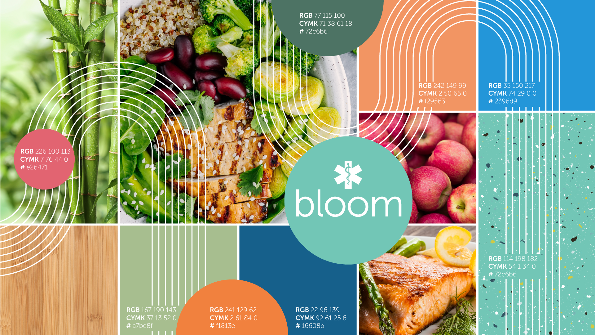
It was requested that the look focus on being trendy and fun. I researched in various ways, seeking input from fields outside of design. For example, I shopped at stores to see their plant pots, I looked into popular earrings/trinkets, and of course, I watched many of the other shows NBC offers.
I found that retro was increasing in popularity, and I decided to take inspiration from the Art Deco movement. Swapping our diagonal lines for more rounded repetitive lines.
To achieve a friendly/fun feeling, I used organic shapes that echoed our circular logo. I also presented new color schemes that updated the current colors to be more lively. This organic feeling also better fits the show which focuses on wellness and natural remedies.
Lastly, I worked to get new assets to be used, such as reshooting Gayle’s headshot.
-
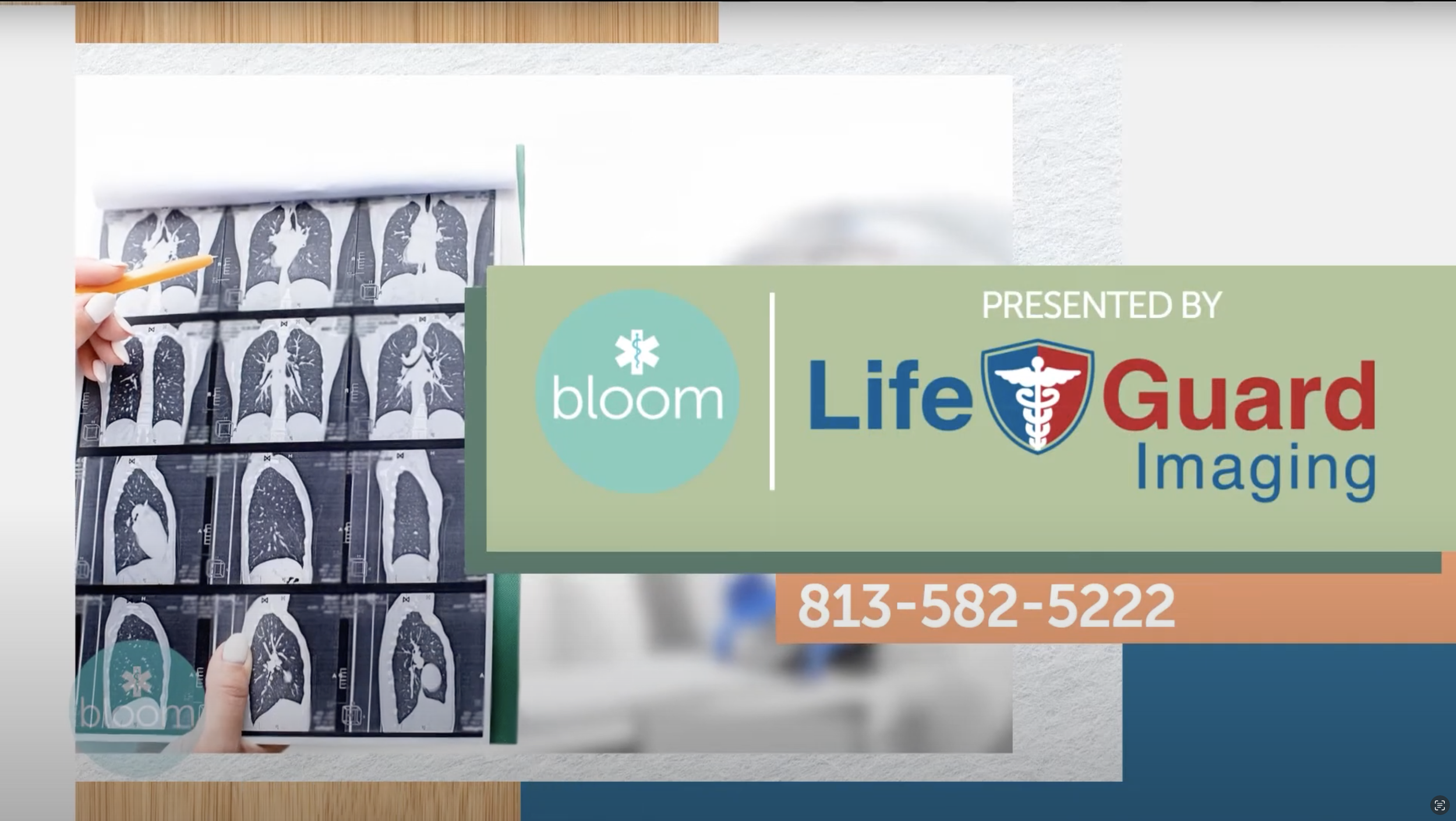
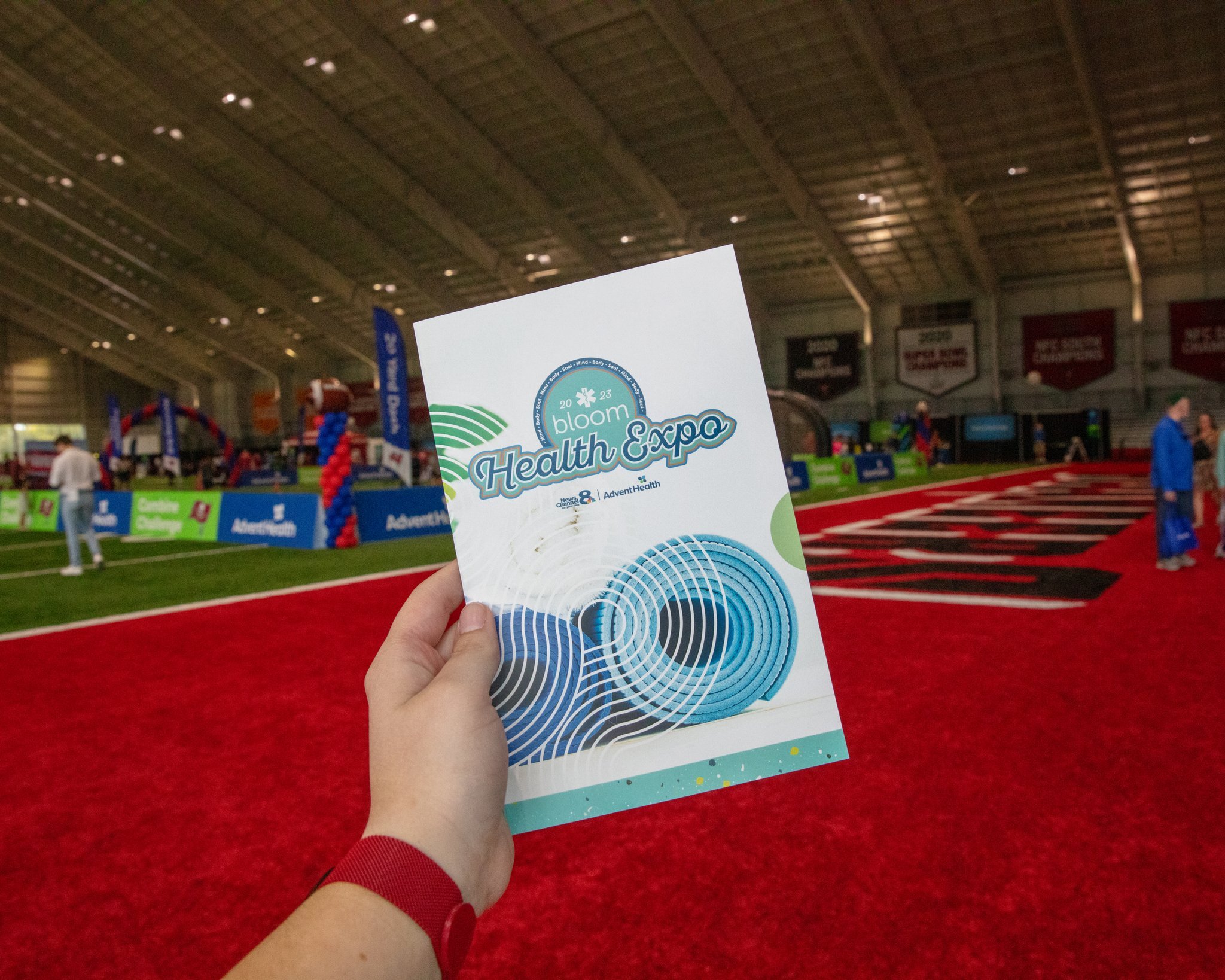
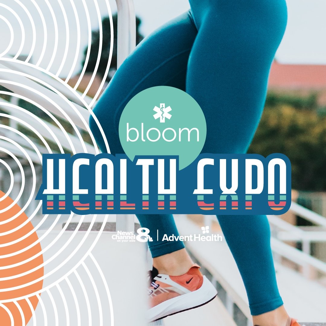
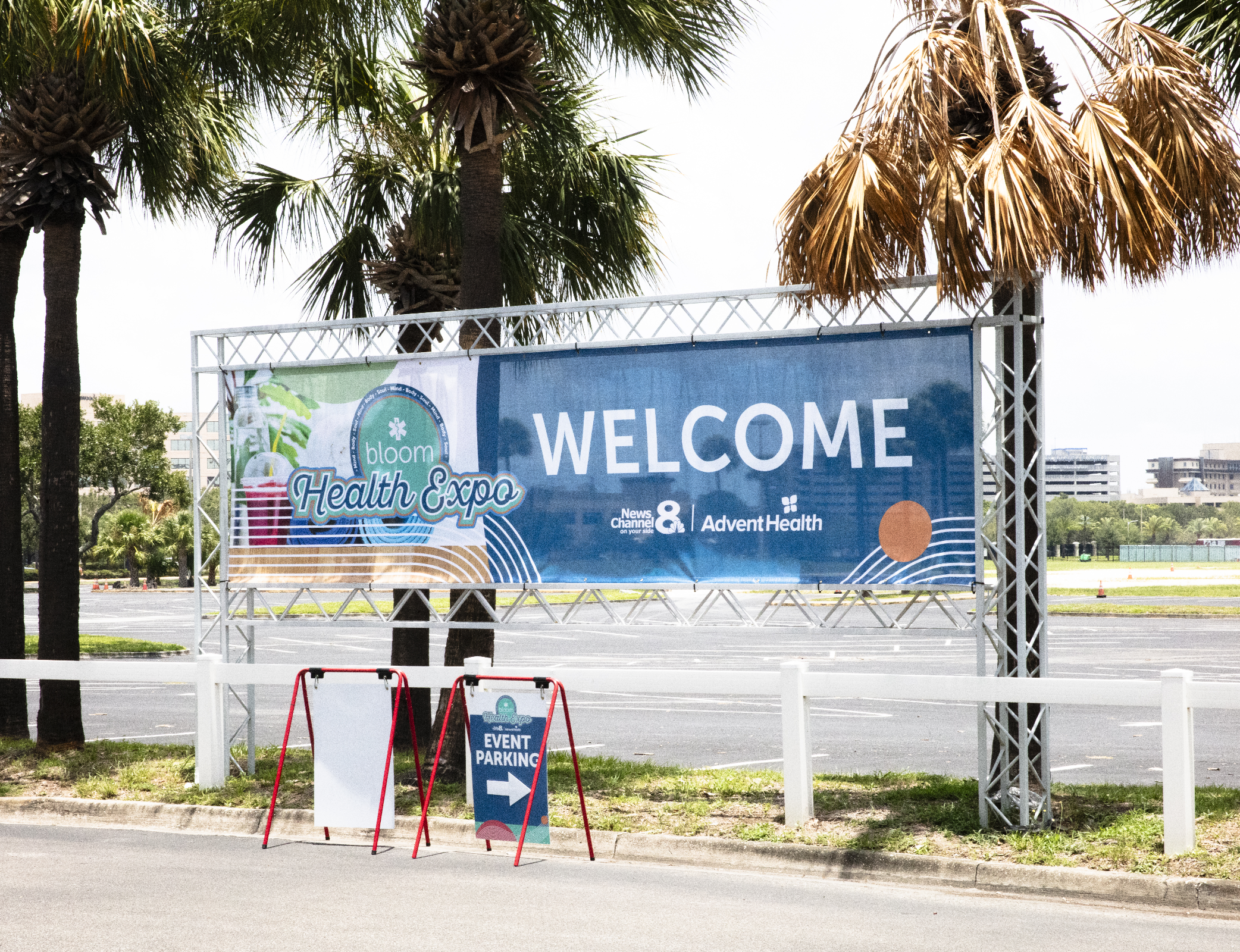
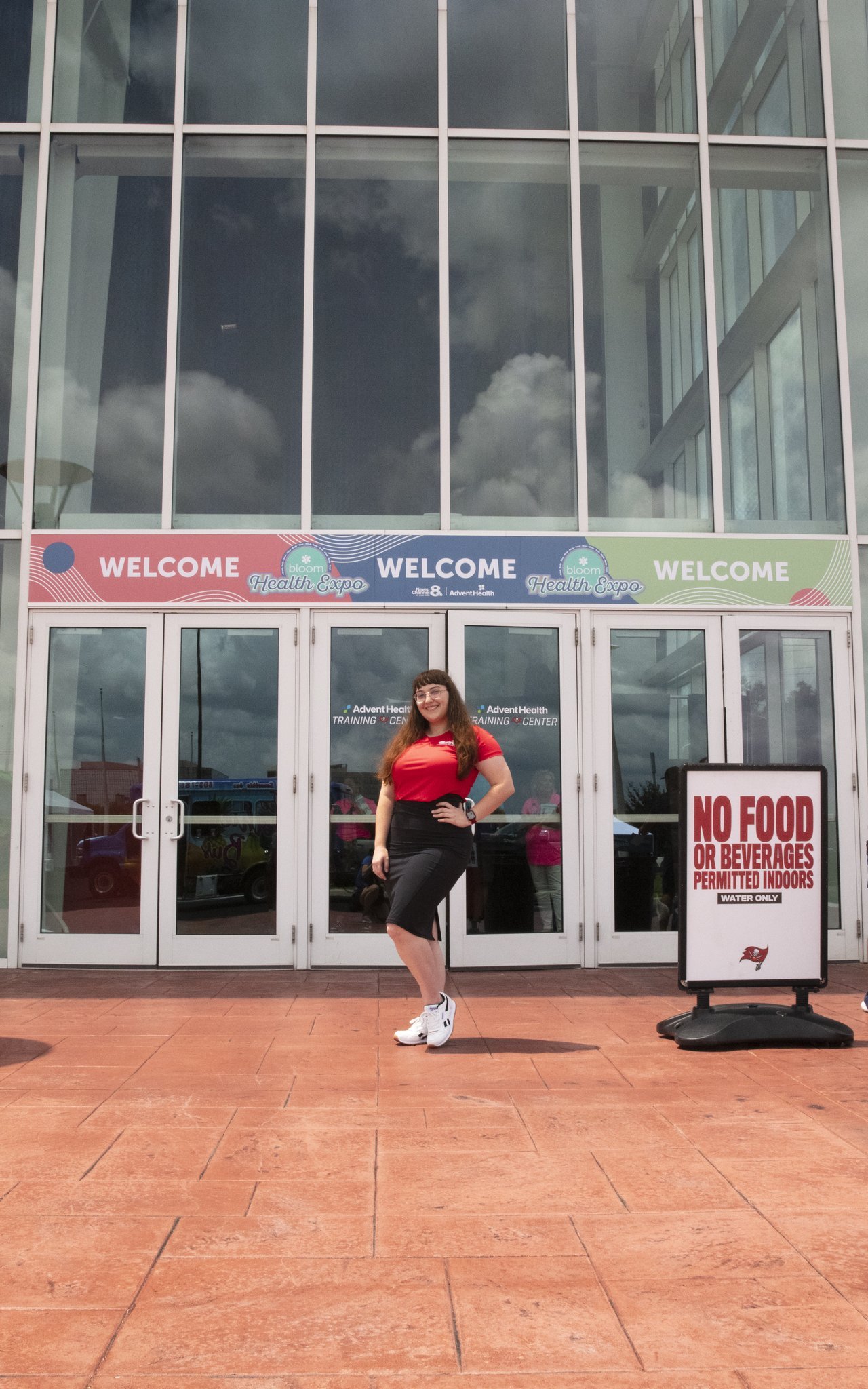
When creating the elements for the health expo I wanted to create harmony with the original but also a clear boundary so that it was obvious that this was a new element while being promoted on the show.
The show includes more white to allow a better contrast with the text and allow for the placement of sponsor logos. The expo focused more on the darker side of the Bloom color spectrum with blues and oranges.
-
Since we as the design team can not be available for every show every day, we create templates that can be used by producers through the Ross Xpression platform.
I create these templates through a combination of videos created in AE and elements available in the Xpression program. Using visual logic to control what elements the producers can change/edit.
Bloom
We have been fortunate with our growth, adding a digital show, expo, and website within the framework that I created.
Bloom
I work closely with the Bloom team, assessing all graphical needs and producing elements.
Mockup Used: (Phones Above) svstudioart on FreepikBloom
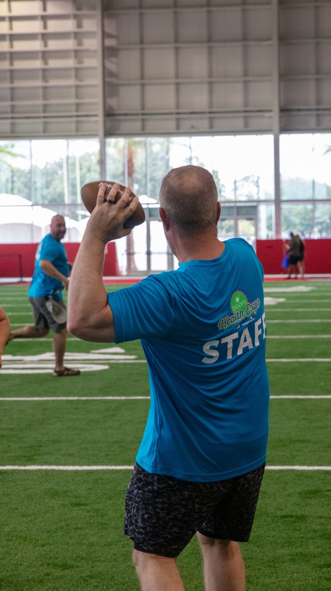
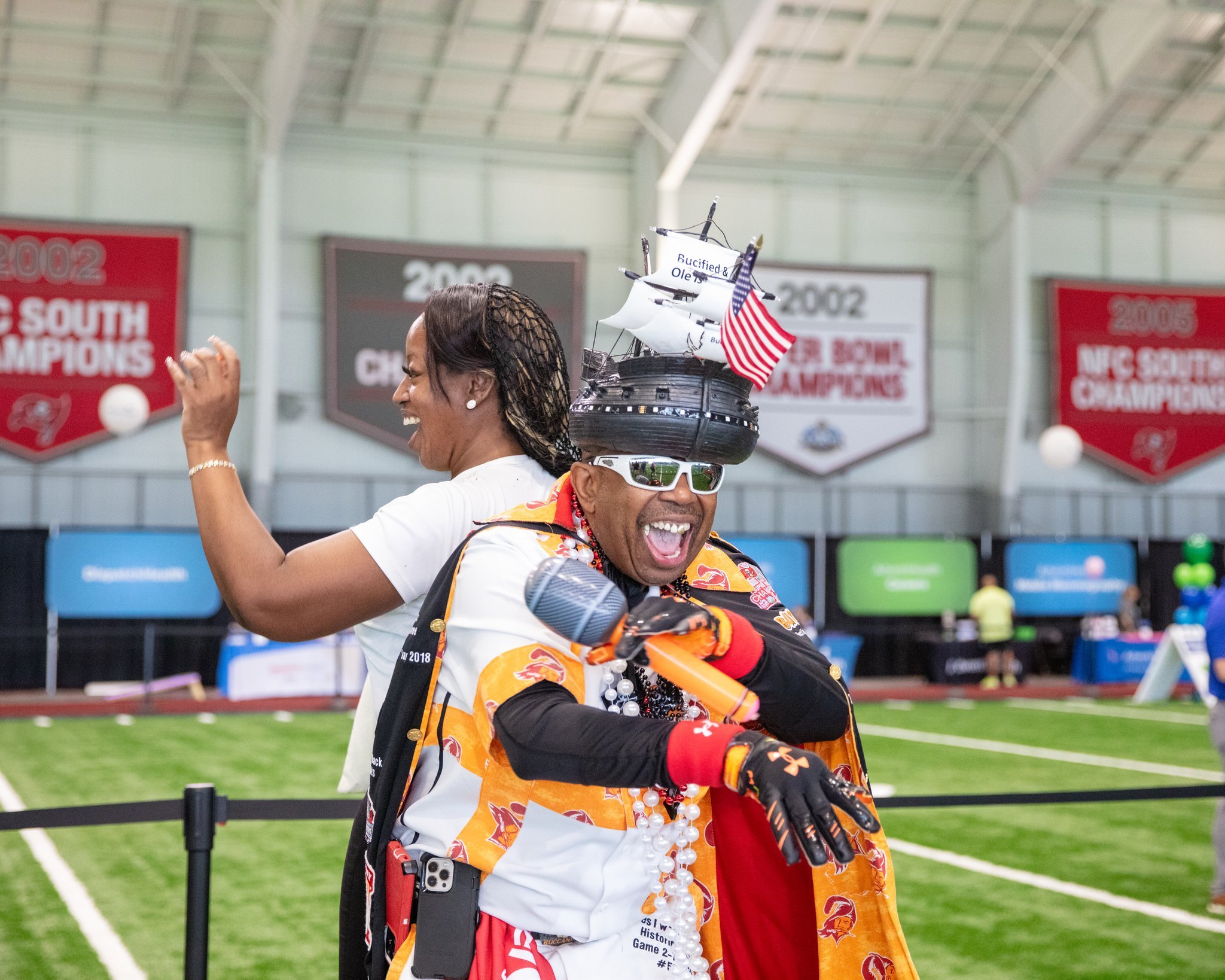
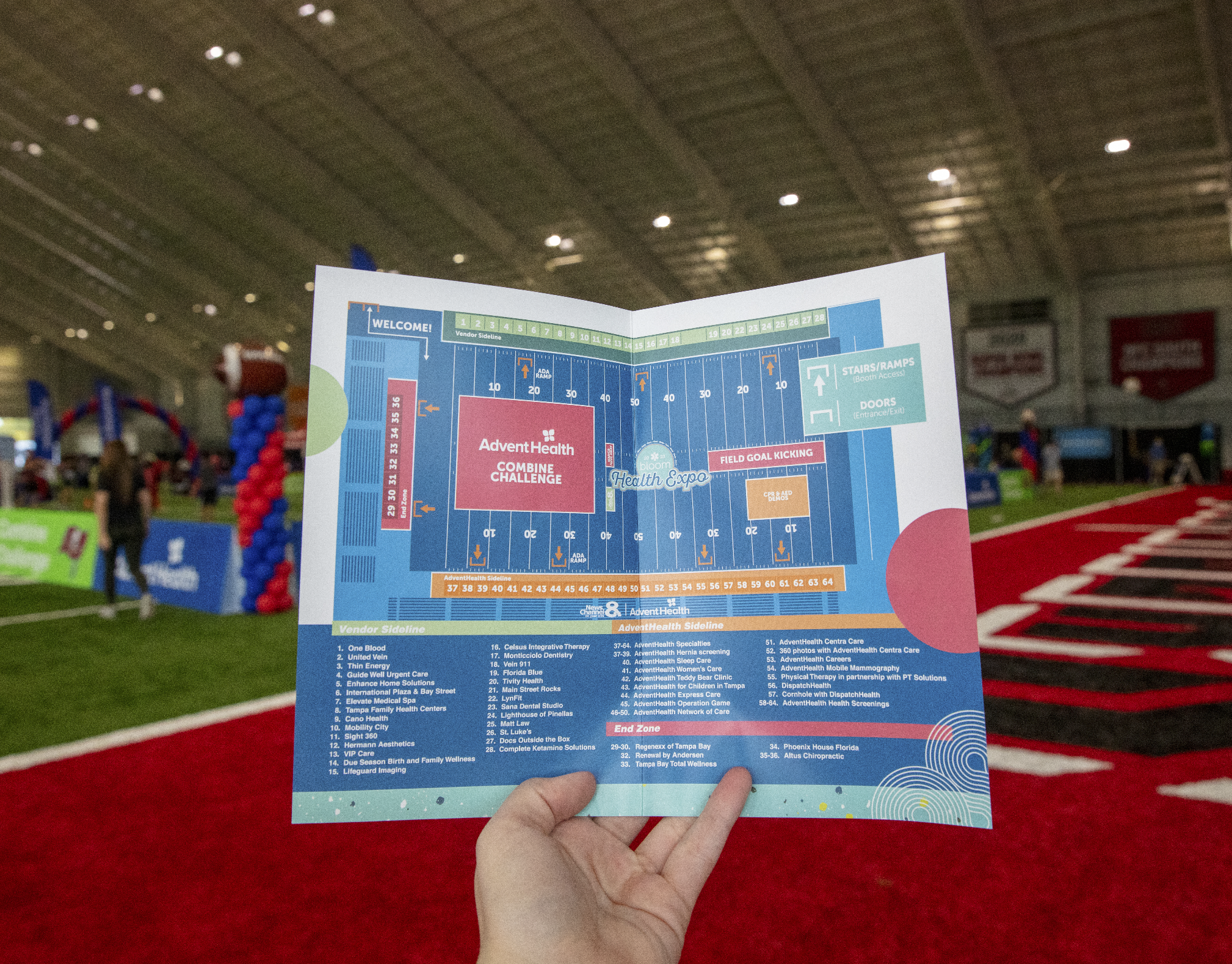
Each year I create any and all graphical elements needed for our health expo.
Bloom
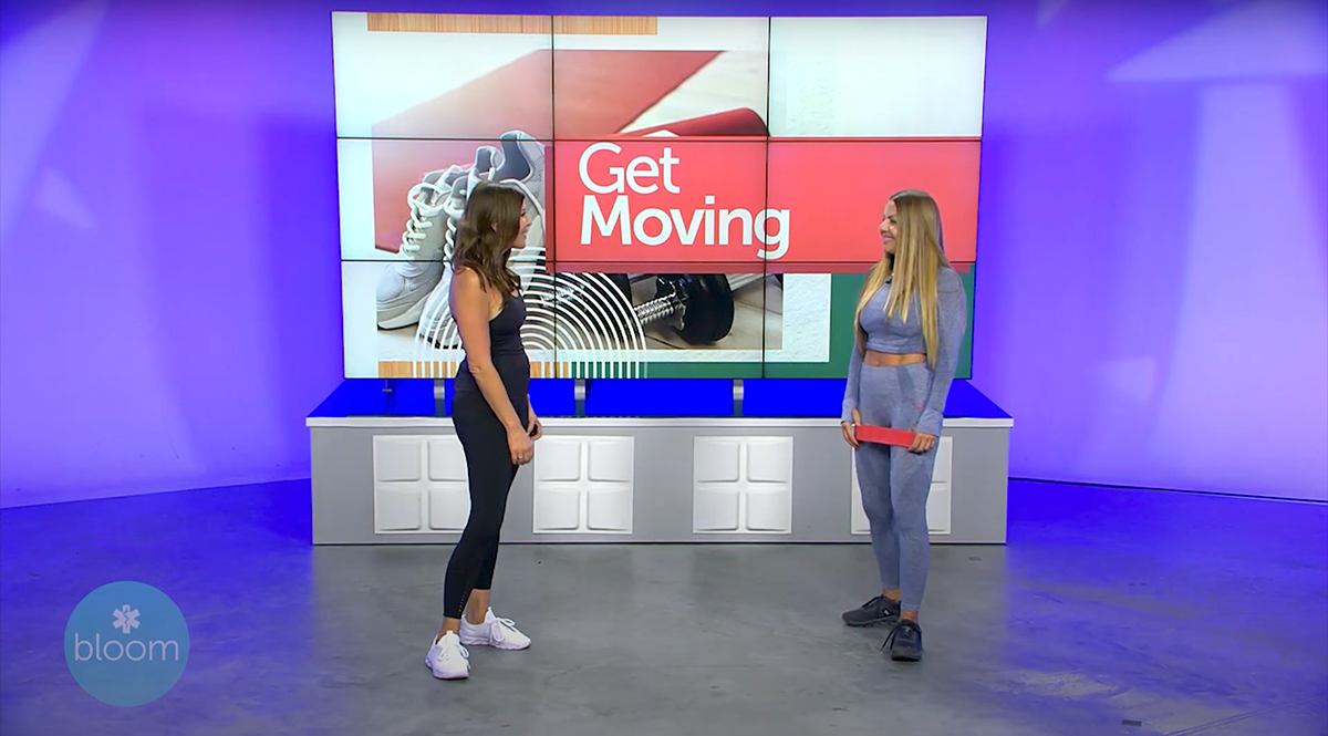
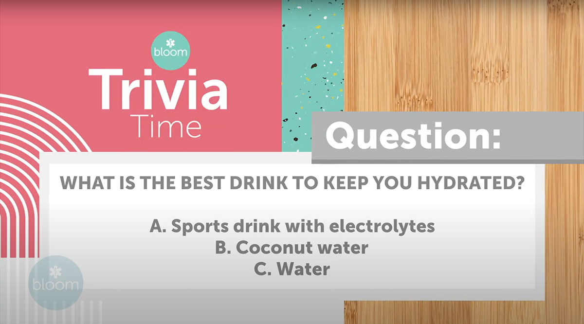
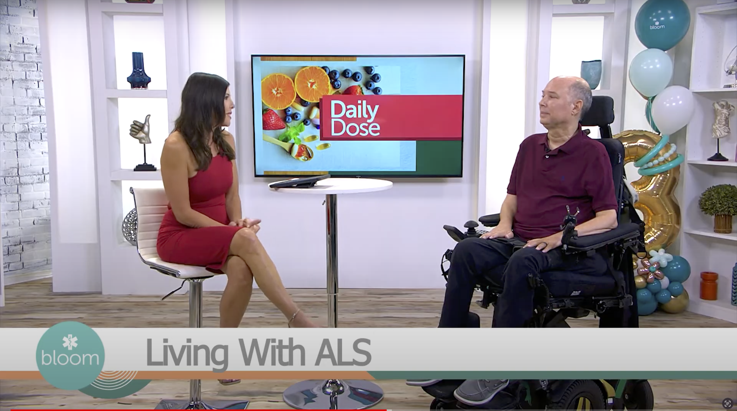
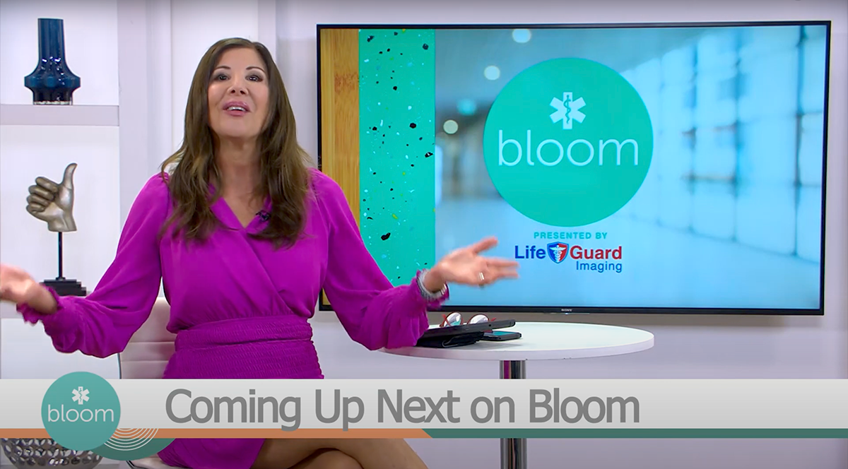
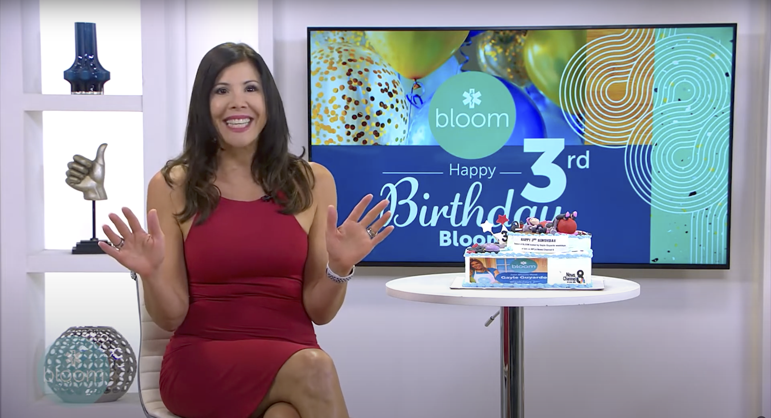
On a more daily basis I create promos, fullscreens, socials, news graphics, print elements, and more.


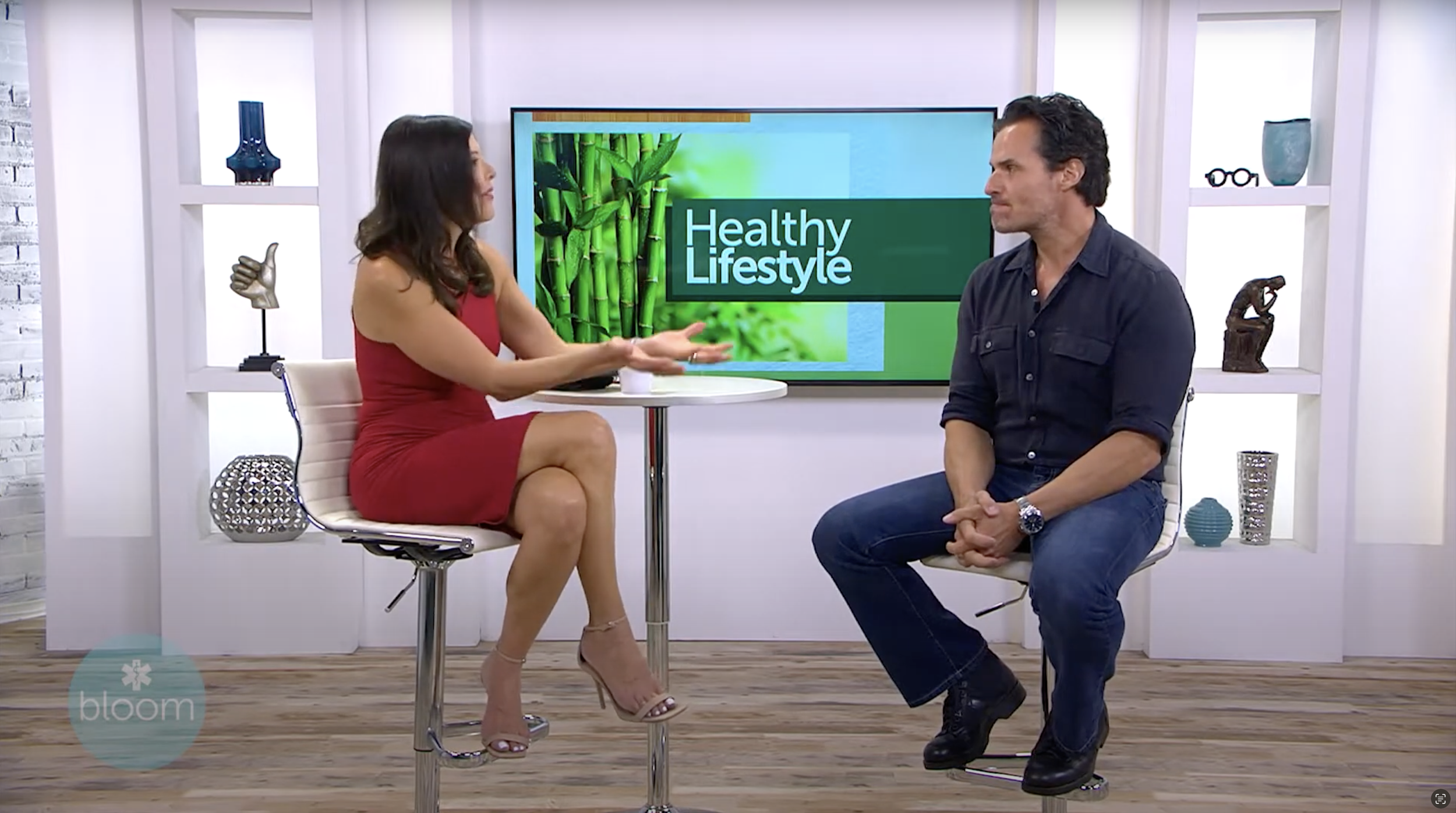
Where we came from
To give an idea of how the brand has evolved since I took the lead here is a very early episode of Bloom in the prior look. I have taken great care to evolve the look without completely losing our roots. The diagonal lines became organic and curved, the transitions became more Art Deco-inspired, and the imagery became more modern. Most importantly, with the establishment of a cohesive style guide, the brand has become more consistent across platforms, allowing for spin-offs such as the expo and health club that have their style but are still very much under the same umbrella of the brand.